Reimagining Your Tiny Kitchen
Outdated, cramped, crowded, or unsafe? If you can use any of these adjectives to describe your kitchen, let’s face it, you probably hate it.
We hear it all the time. The good news is, you’re not alone. According to HOUZZ, being less than ‘in love’ (or even ‘like’) with your kitchen was the number one reason homeowners choose to undergo a kitchen remodel. Moreover, empty nester Baby Boomers are increasingly staying in their homes longer, and planning for their future “living in place” needs.
HDR Remodeling recently completed a kitchen makeover project in Berkeley, which provided us with the challenge of transforming a tiny, funky and “unloved” kitchen, into a fun, and functional hub of the home.
Before - A funky Little kitchen - with BIG potential.
The PROBLEM
Our clients, a young couple with an expanding family, had outgrown their tiny kitchen. Frustrated with its overall condition—a mismatch of appliances, limited counter and storage space, and outdated finishes, their kitchen fit all the “I hate my kitchen” descriptors.
Additionally, due to their kitchen remodel budget, our clients did not want to undertake significant structural changes, so we were constrained to the existing footprint of the kitchen. (Our cost-effective solution didn’t involve a structural engineer).
Reimagined kitchen with clean lines, clever storage, and fantastic functional flow.
The PROJECT
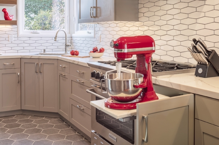
Tasked with bringing this 1940’s-era kitchen into the 21st-Century, HDR Remodeling architect Milton Tong collaborated with designer Heather Cleveland, of Heather Cleveland Design, one of our trusted design consultants, to reimagine this small, cramped kitchen with clean lines, intuitive flow, functional “zones,” and clever storage alternatives - including a pull-out “appliance lift” to house a much used Kitchen-Aid.
Limited to the kitchen’s original 200 sqft., we had to do it within a tight budget while meeting our client’s main objectives:
Maximize existing space and natural light
Minimize visual clutter
Modernize look, feel, and functionality
Make the kitchen beautiful
+ View More on Residence Statistics

See residence details and goals for the kitchen remodel.
Hidden appliance garages for clever storage solutions.
Open shelving for added space
The SOLUTION
Space is the place - at least in this kitchen makeover. Our goal was to create an efficient and beautifully designed kitchen with timeless appeal—and use every inch purposefully.
By removing a portion of the wall between the dining room and kitchen, we were able to achieve an open floor plan, expand the kitchen space, and integrate the two rooms—without major structural changes - at a significant cost savings to our clients.
The newly acquired space provided by the wall removal, allowed us to create a cozy breakfast nook for less-than-formal dining options—or just more counter space.
In the “Before” and “After” photos of this kitchen remodel, you’ll notice the appliance locations were reconfigured to create the optimal functional “triangle” between the sink, stove, and refrigerator. Additionally, we removed all but one of the stove side cabinets, to create “MMMMax Headroom.”
“Space is the Place.” A tiny kitchen gets room to move.
Given the neutrality of the palette, we had fun with the finishes. A boldly patterned white ceramic tile backsplash enlivens and expands the space, while reflecting much-appreciated natural light.
The complementary flooring pattern adds visual continuity and design, and draws attention to the kitchen details to make this kitchen remodel really shine.
Shaker-style recessed paneled cabinetry, in a beautiful taupe grey, belies the kitchen’s newly acquired, and ample, storage space, including appliance garages and appliance lifts, combined with other clever solutions for clutter-free countertops.
The finishing touches came with unexpected pops of red, predicated on a much-used Kitchen-Aid, and provides just the right amount of playfulness to complete this modern, clean kitchen renovation.
+ View More on the Kitchen Finishes
- Lighting: Rejuvenation, Laurelhurst 8” Pendant with Metal Dome
- Appliance Lift: Rev A Shelf
- Backsplash Tile: RAG/38HX
- Countertops: Vardara, Calacatta Blanco
- Paint Color: Pratt & Lambert, Mirage Grey
+ View More on the Project Timeline
- Design and Planning: 14-16 weeks
- Permit Mobilization: 4 weeks
- Construction: 16-18 weeks
- Total: 34-38 weeks
+ View More on Trade Professionals that Supported HDR Remodeling on this Kitchen Remodel
- Tile: Bay Works
- Electrical: RECO
- Painting: Ortzow
- HVAC: Apple
- Plumbing: C-Delon
- Drywall: Kevin R
Cabinets: Douglah
An appliance lift provides a handy storage solution for much-used & heavy kitchen appliances.
The OUTCOME
“Our kitchen had become almost un-functional, even unsafe at times. We never wanted to entertain. The team at HDR Remodeling listened to our needs, addressed our concerns, then proceeded to transform our kitchen beyond our wildest dreams. It’s been life-changing.”


