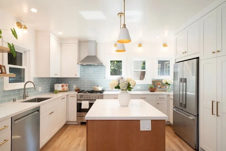
It’s an exciting time when you’ve decided on designing a new home or renovating part of an existing one. However, the process of getting from this point to the end result doesn’t always seem so straightforward. The design-build process can be somewhat of a mystery if you’ve never experienced it before. It differs from the traditional design-bid-build approach, and although it sounds newer, this format has existed for thousands of years.
Characterful Homes: A Move Away From Minimalism
As the saying goes, the only constant is change, and this is certainly true when it comes to interior trends. The frequent shifts in popularity for a particular movement and the lightning-quick pace at which micro trends emerge are understandably dizzying. It’s hard to keep up and frustrating for homeowners looking to create a home that stands the test of time.
However, there’s recently been a noticeable shift from spaces featuring stark minimalism and ultra-clean aesthetics to homes that are characterful and much more personalized. And before you worry, this movement towards the personal might offer some much-needed (and long-lasting) respite from the trend cycle.
Why Characterful Houses Are Gaining Popularity
Minimalism and tenets of Scandinavian and Japanese-inspired design have had a sway over the design industry for many years now. Their bright and breezy interiors felt lighter than those that leaned more maximalist. In 2020 and the couple of years after, we spent most of our time at home. There was a need and a want for these spaces to feel clean and serene, and offer a calming sanctuary. But this is now beginning to shift.
Although minimalism brings with it clean lines, clutter-free spaces, and simplicity, it makes some homeowners feel like their homes are stripped of uniqueness. Houses start to feel cookie-cutter, and moodboards are full of the same, gray, greige, and white spaces. There are no hints of their own identity within their living spaces. A movement to happen where rooms are full of sentimental objects, interesting artwork, and personal touches that you won’t find in every home.
Can Minimalist Design Be Personal?
While this shift occurs, you might be wondering if it’s possible to blend both minimalism and characterful homes. The answer is absolutely. You don’t have to go all-out maximalist to create rooms that feel more intriguing. Adding character could be something as simple as a few art pieces that mean something to you or something more complex but simple nevertheless, such as incorporating structural beams from an old house you used to live in into a new one. If you want to go all out with color, pattern, and texture, that’s perfectly fine too. Character is about bringing personality in, as much or as little as you like.
Ways to Add Personality to Your Home
If you’re looking for ways to make your home feel full of character and have decor and design features more intrinsic to who you are, these are the best paths forward.
Share Meaningful Details with Your Designer
One of the best ways to ensure your home has character, as opposed to decor driven by trends and not your own interests, is by sharing important features and ideas with your designer. If you have a specific hobby, a fascination, a collection, or specific elements that you love, these are wonderful ideas to bring to the table. In knowing this, builders and designers can create a home that reflects who you are.
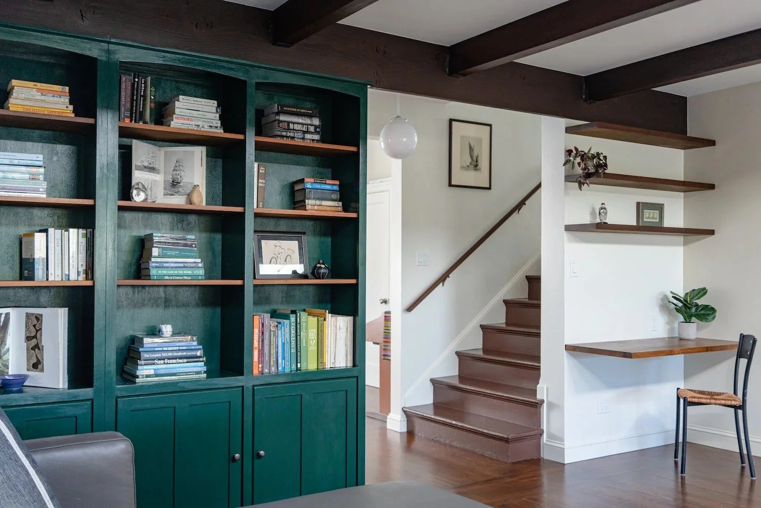
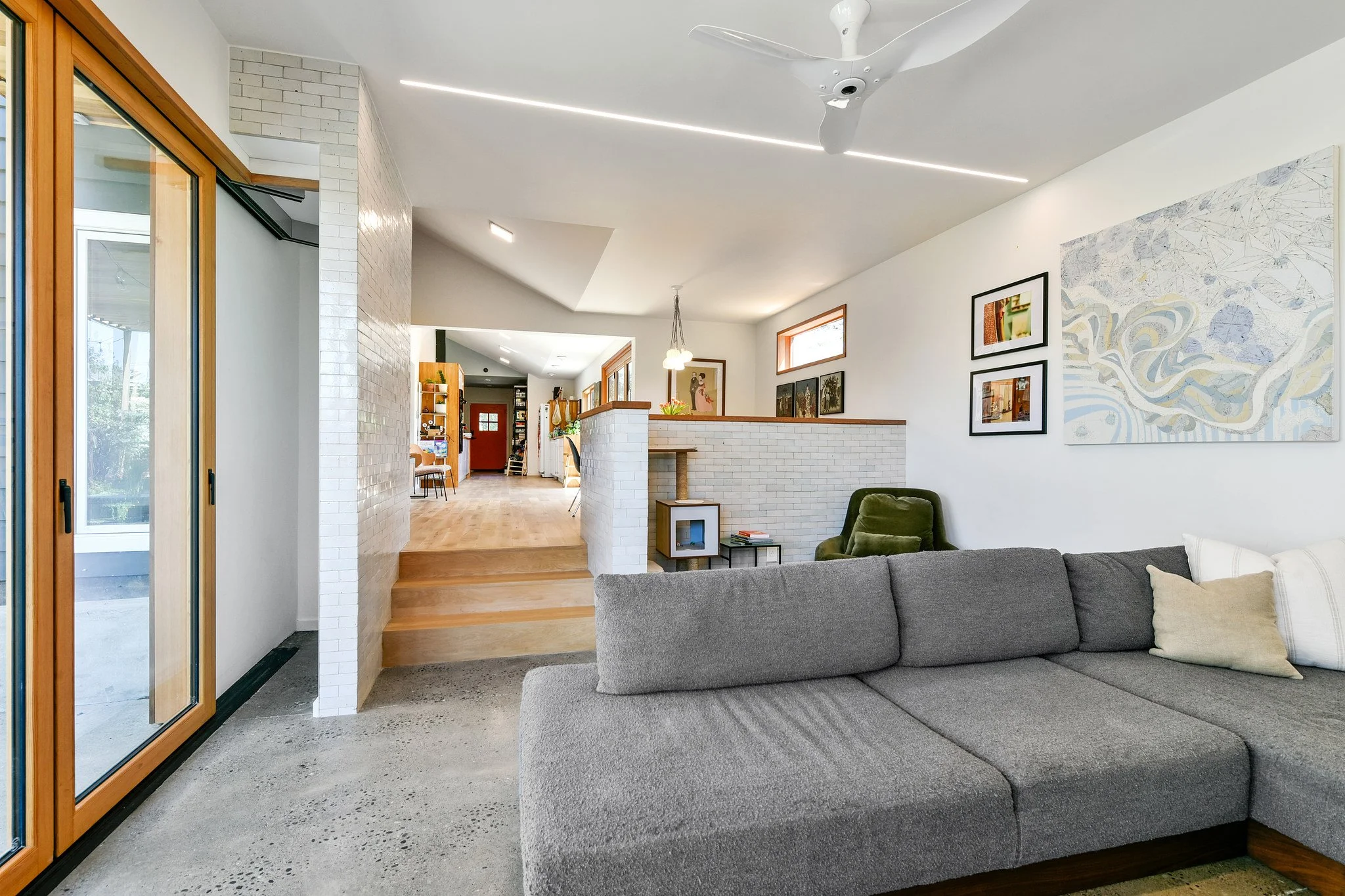
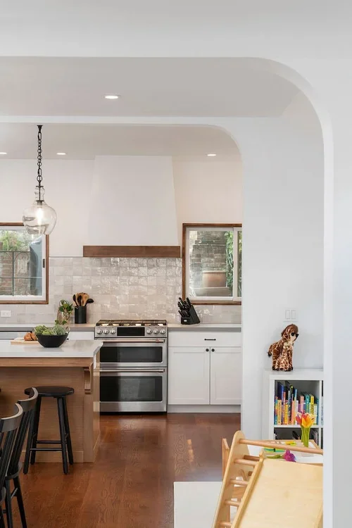
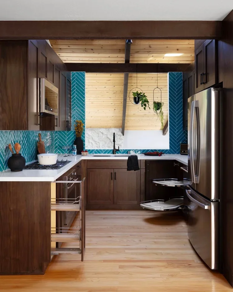
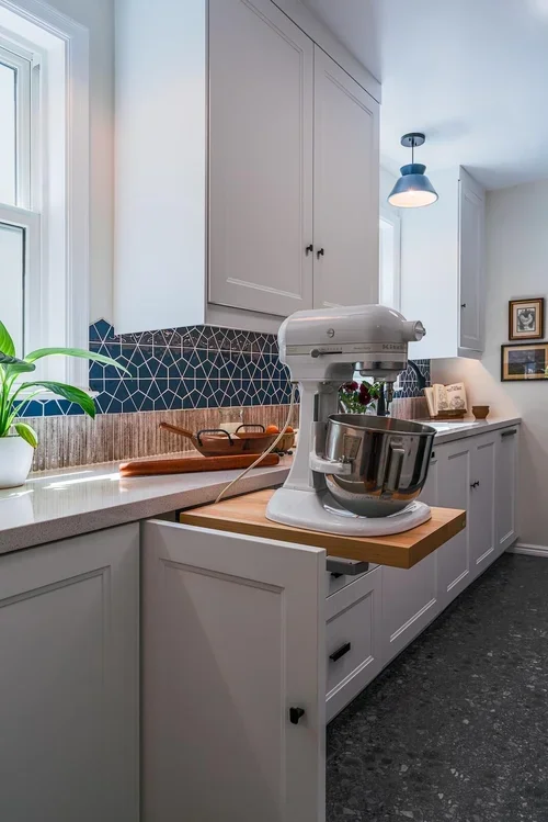
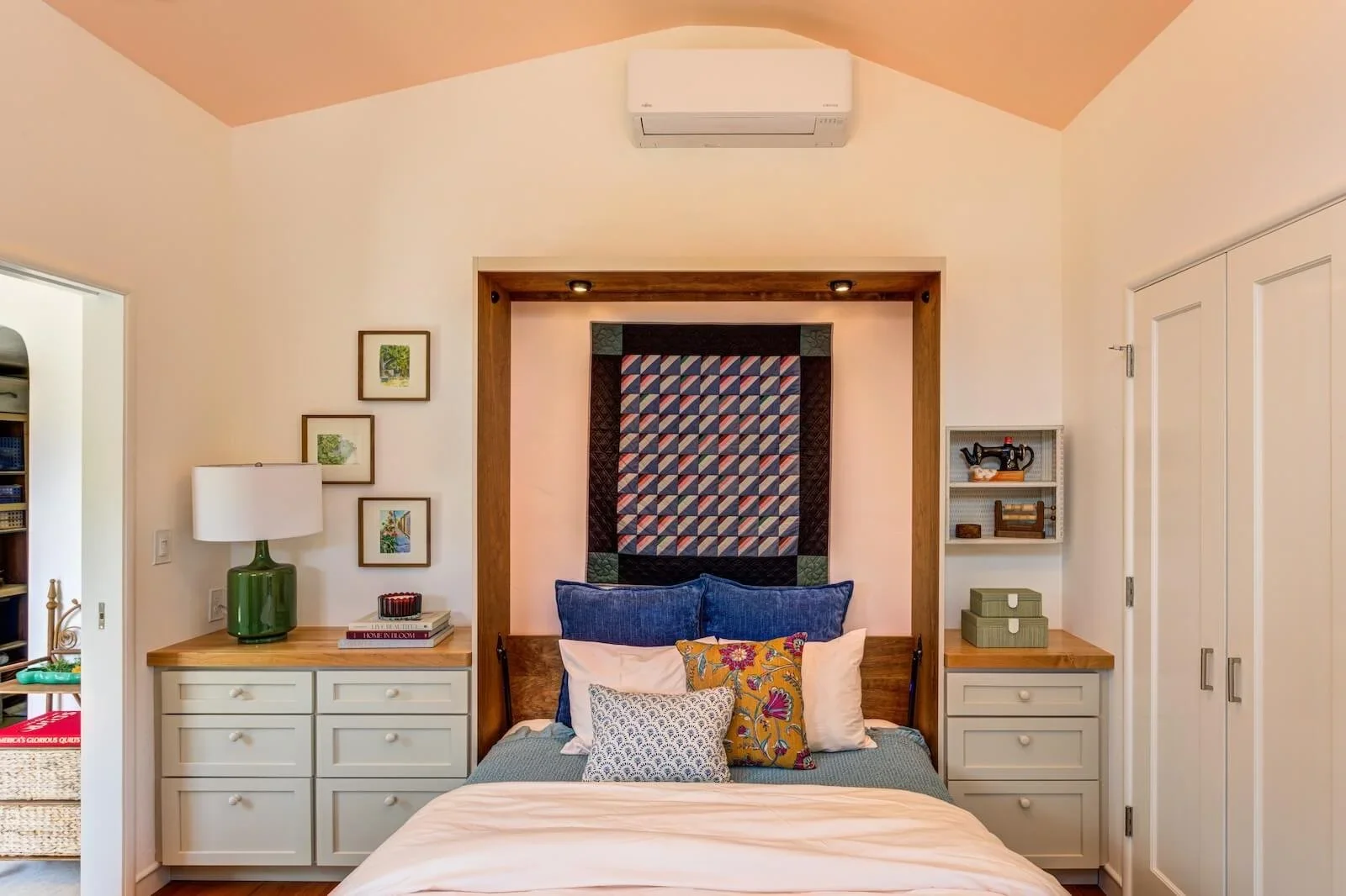
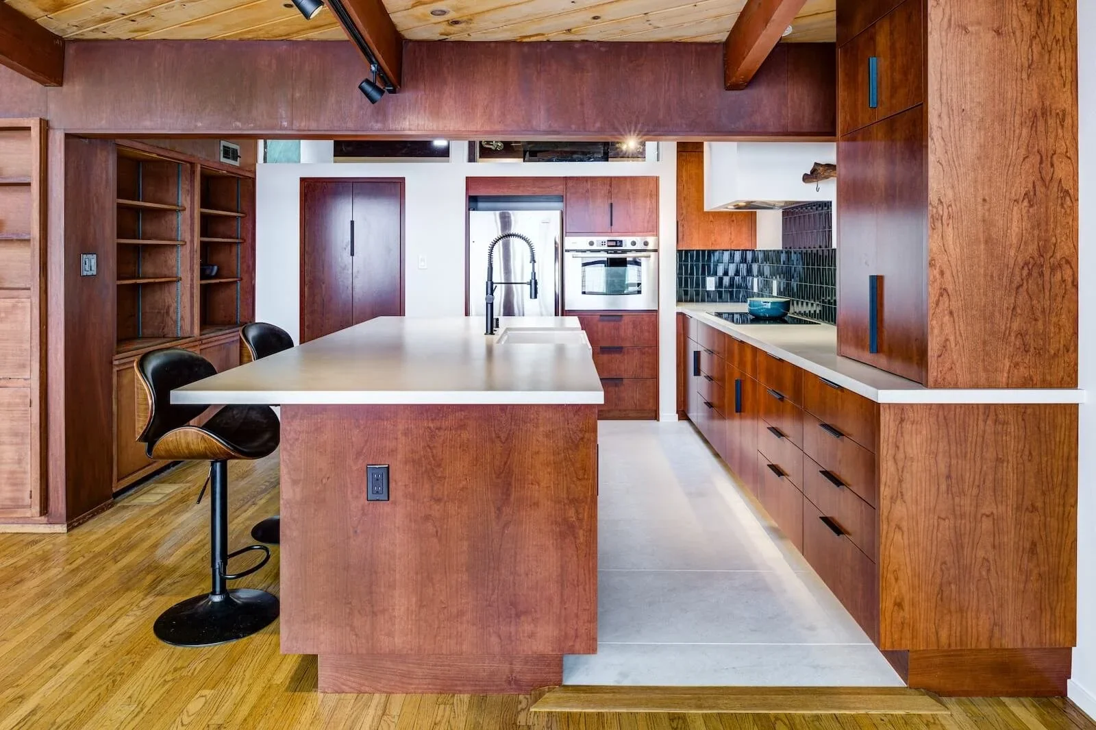
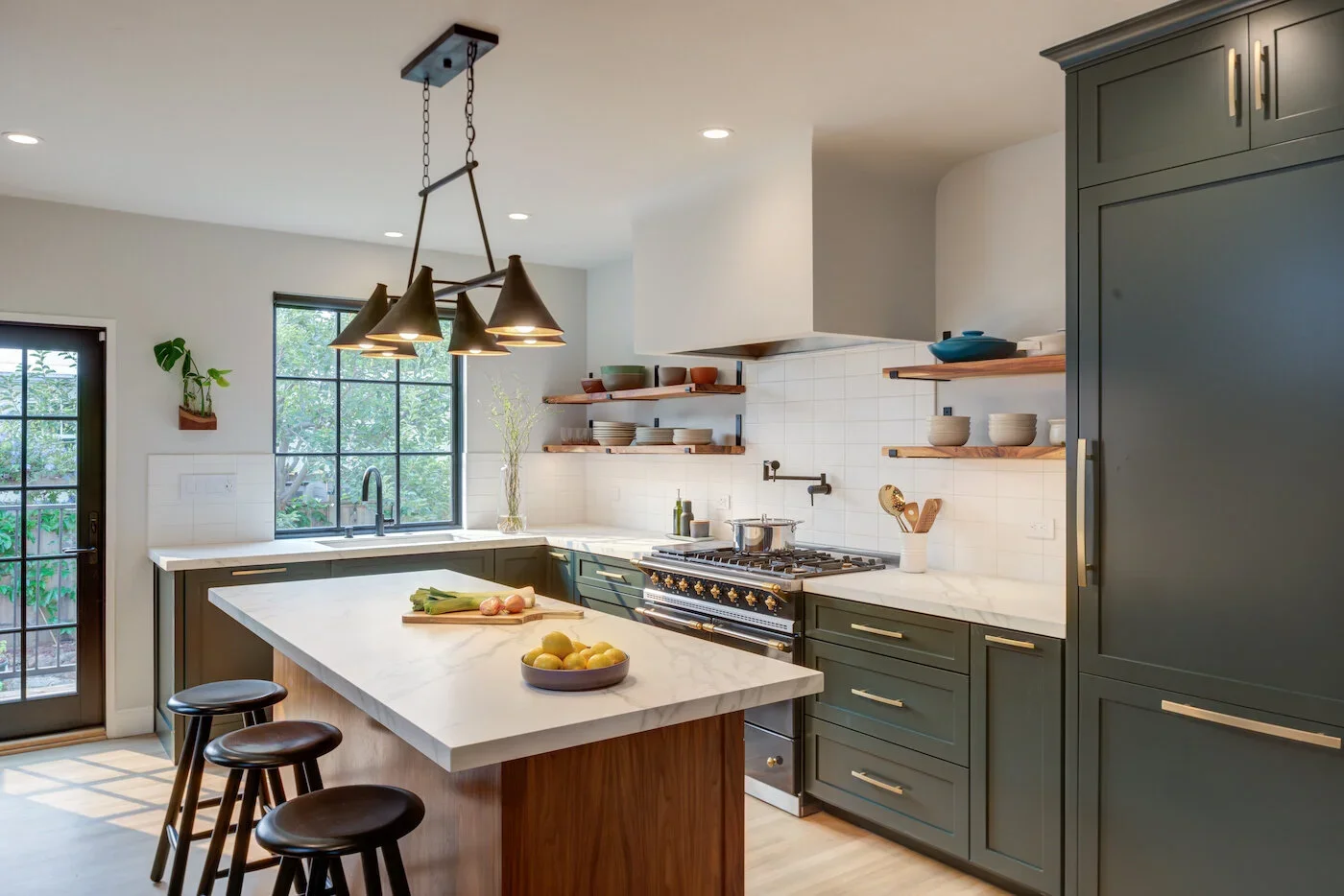
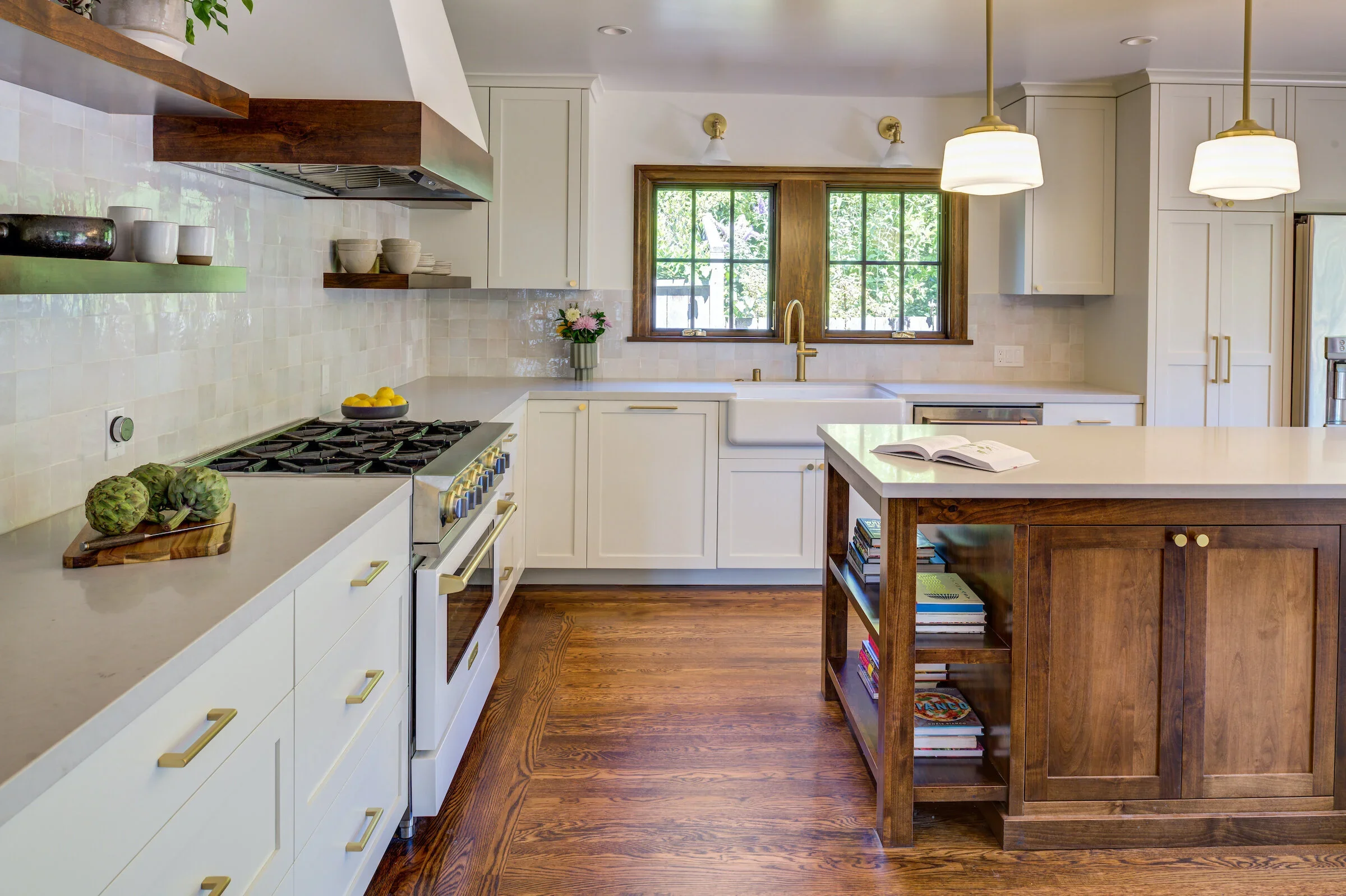
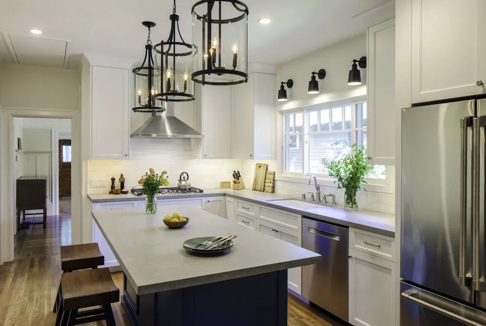
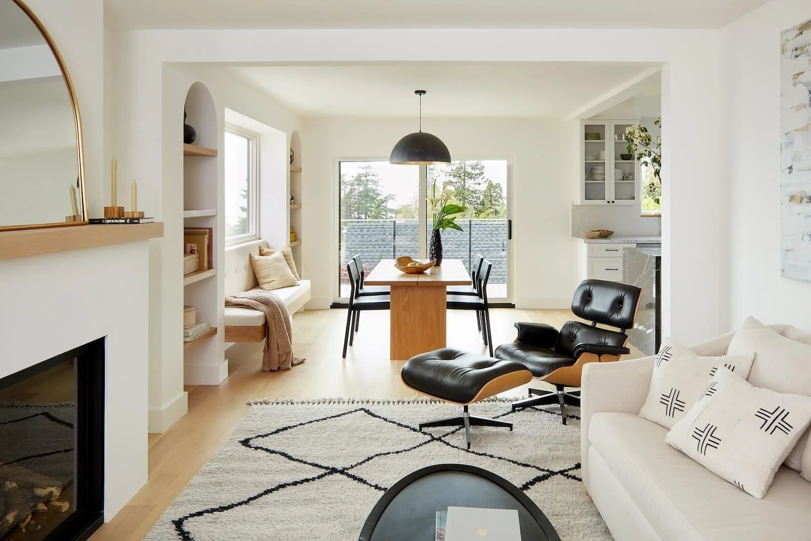
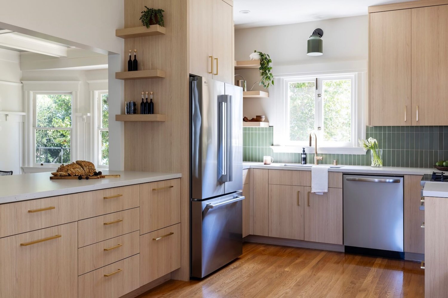
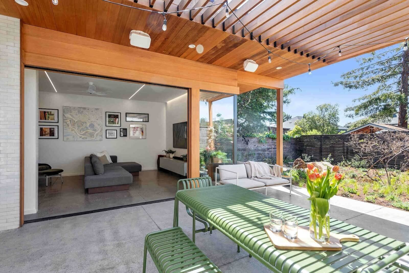
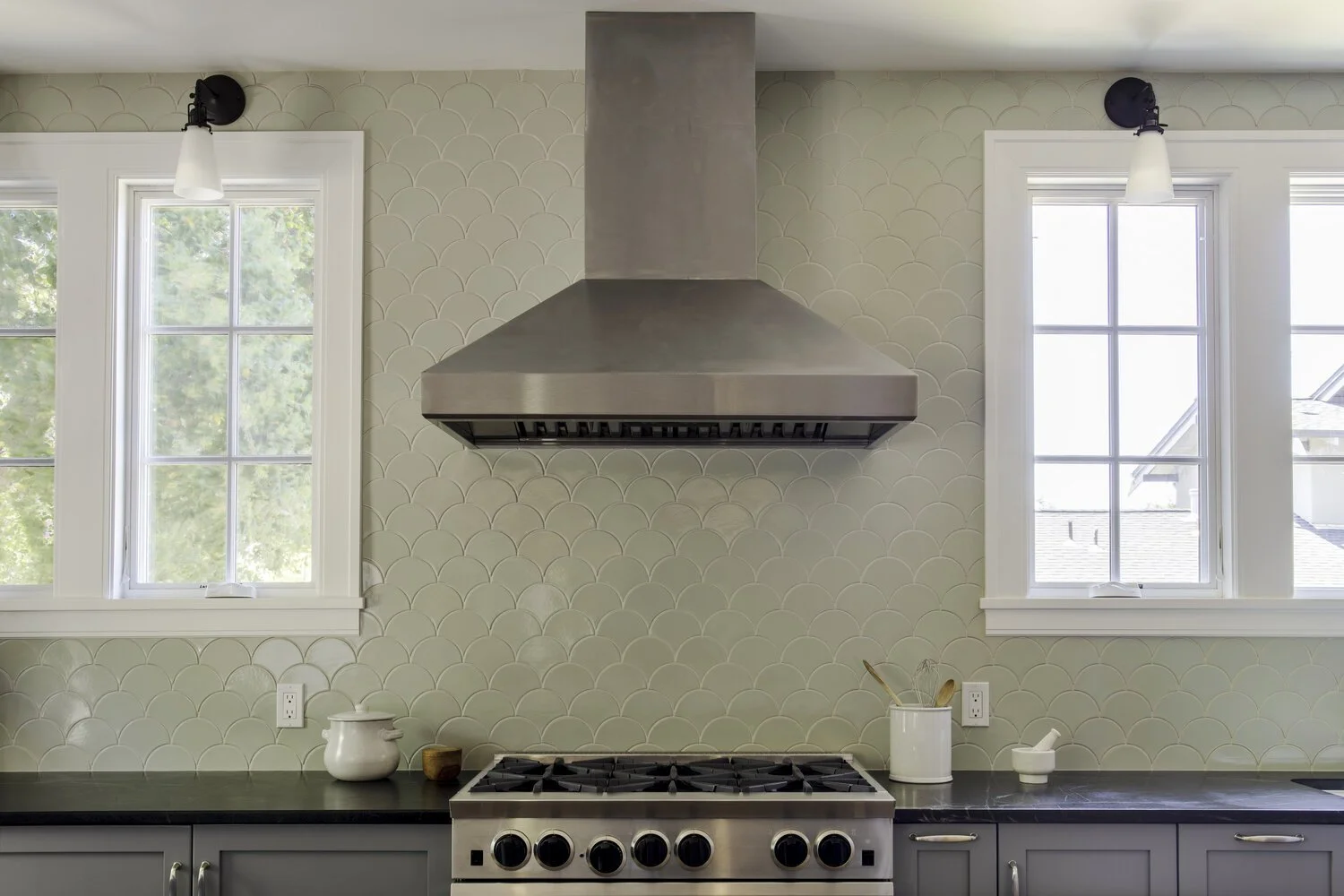
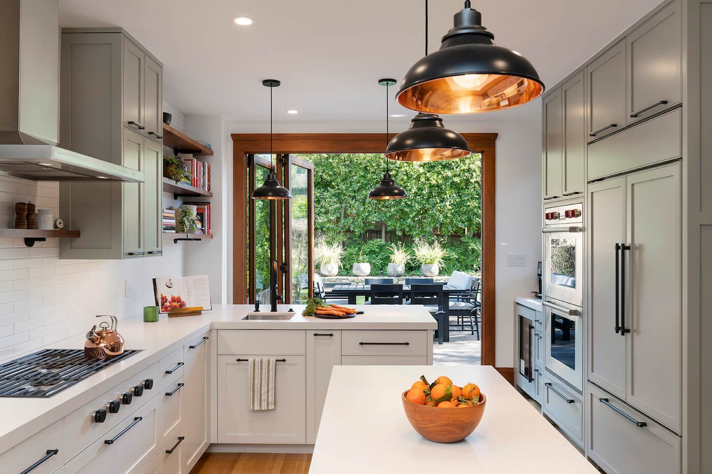
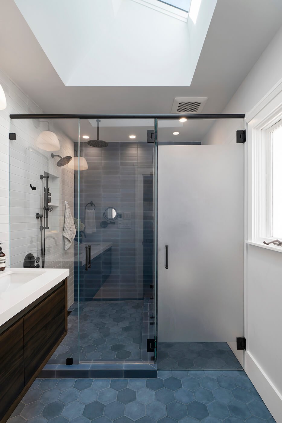
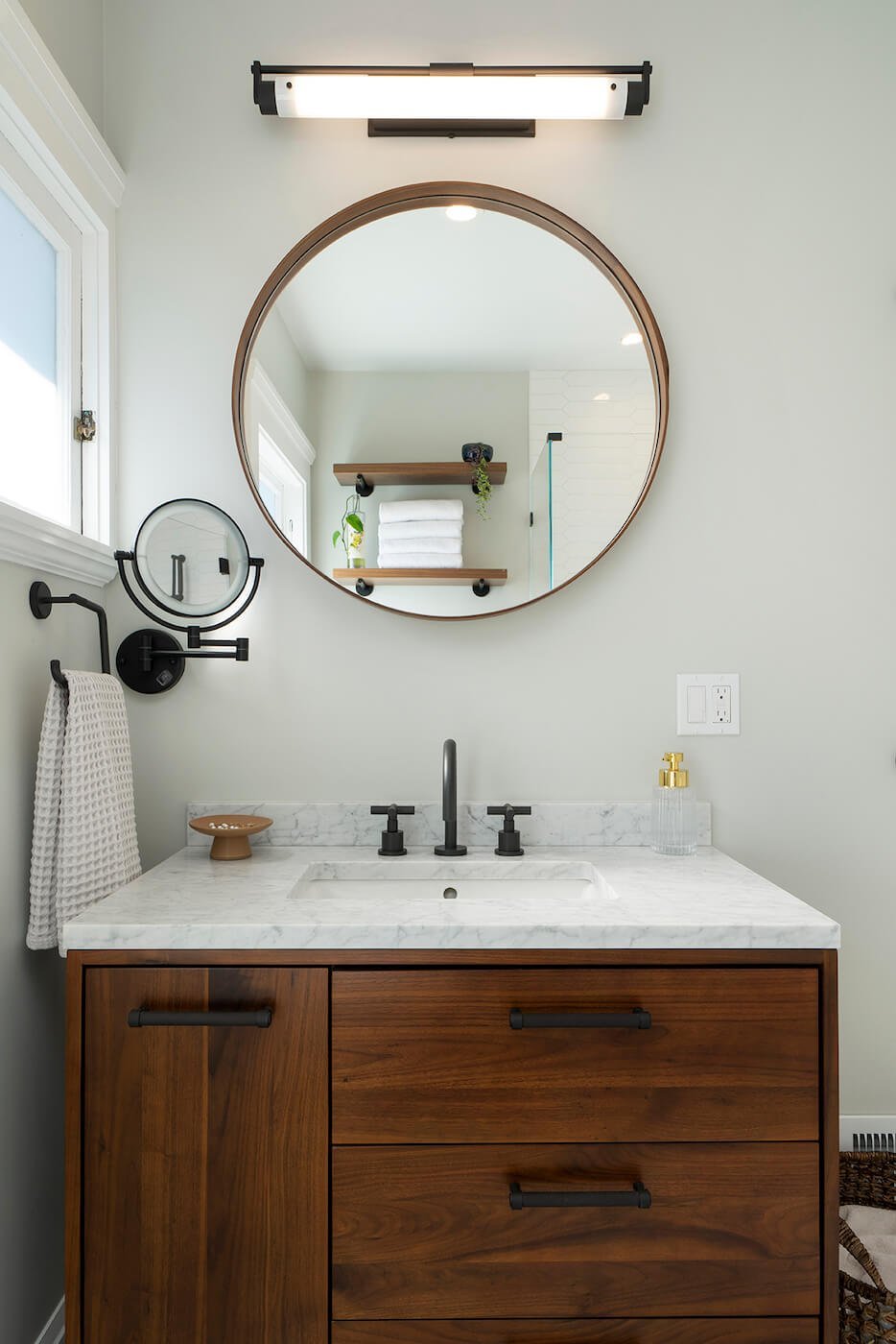
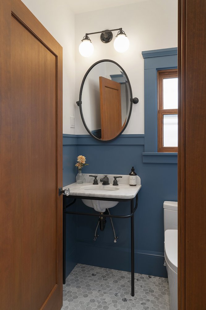
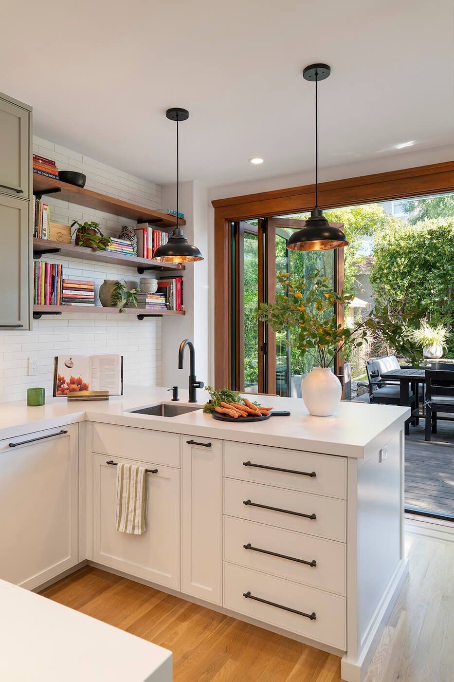
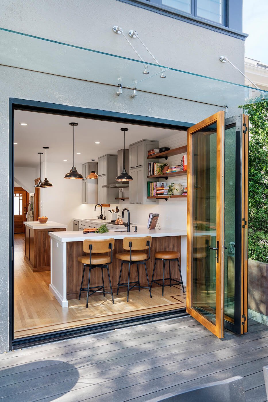
They can also bring out historic features or existing elements that you adore that are already present in your current home while still creating a modern space that’s fit for purpose. A client of ours (their space pictured above) had a penchant for wood finishes and deeply appreciated the art of woodworking. Our team was able to translate this into a home that was consistent and cohesive, but characterful.
Look Outside of Trends
Trends can be viewed as a great starting point. They’re useful indicators for telling you what you’re interested in, and the techniques, features, styles, and colors you’re not taken by. If you use them as a gauge, it’s easier to create a home that’s more personal. A house filled with trendy items is simply that.
For example, certain colors have come in and out of fashion (like bright whites, neutrals, and any colors of the year), but you might find that a deep navy or a bold turquoise is a better fit for a room you’re renovating. One that’s uniquely curated to your own preferences and interests will feel more fulfilling and have more longevity. Your enjoyment of a specific look holds more weight.
Add Unique Decor That Tells a Story
This is another strategy that puts your own interests front and center. It’s easy to purchase decor on a whim or shop mass-produced, but to infuse a home with character, your history, personal traits, and preferences need to be involved. In doing so, you’ll curate a home that’s thoughtful and close to your heart.
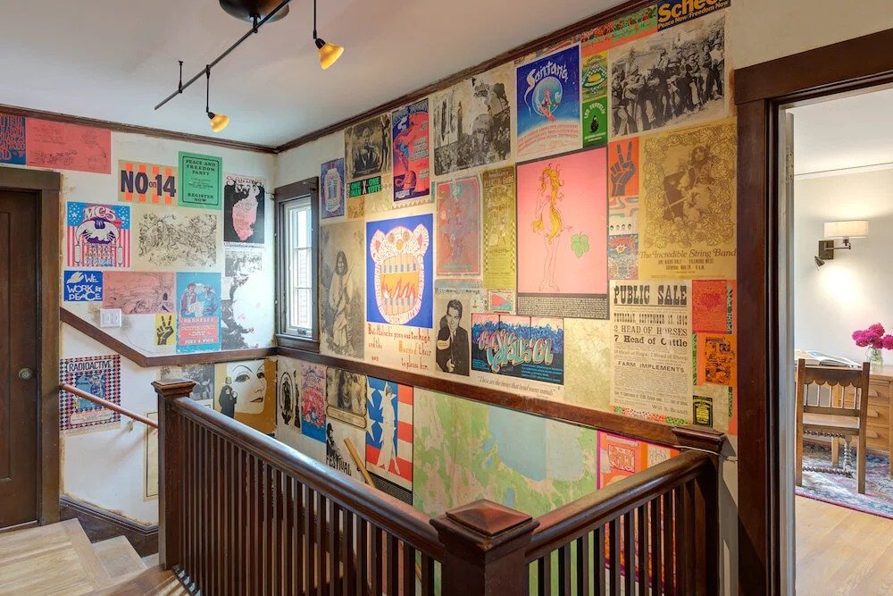
Proof of the power of this happened in one of our Berkeley Hills homes. Our client spent his childhood growing up in this house and wanted to balance the nostalgia of that time with modern renovations. He retained this through decorated stairwell walls, which is something he had as a child. This unique feature won’t be found in every home, and that’s exactly what makes it so special and personal.
Consider Different Color Palettes
Minimalist color schemes bring an air of calm and beauty, but many people are feeling the need to incorporate more color in lieu of builder-grade beige and cold grays. Sometimes, the most unexpected color combinations can give a home the right amount of character.
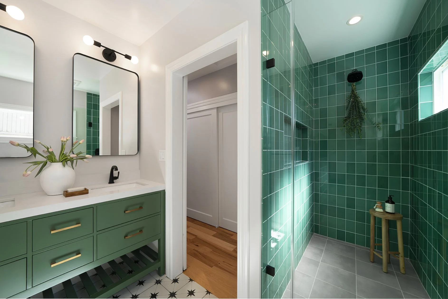
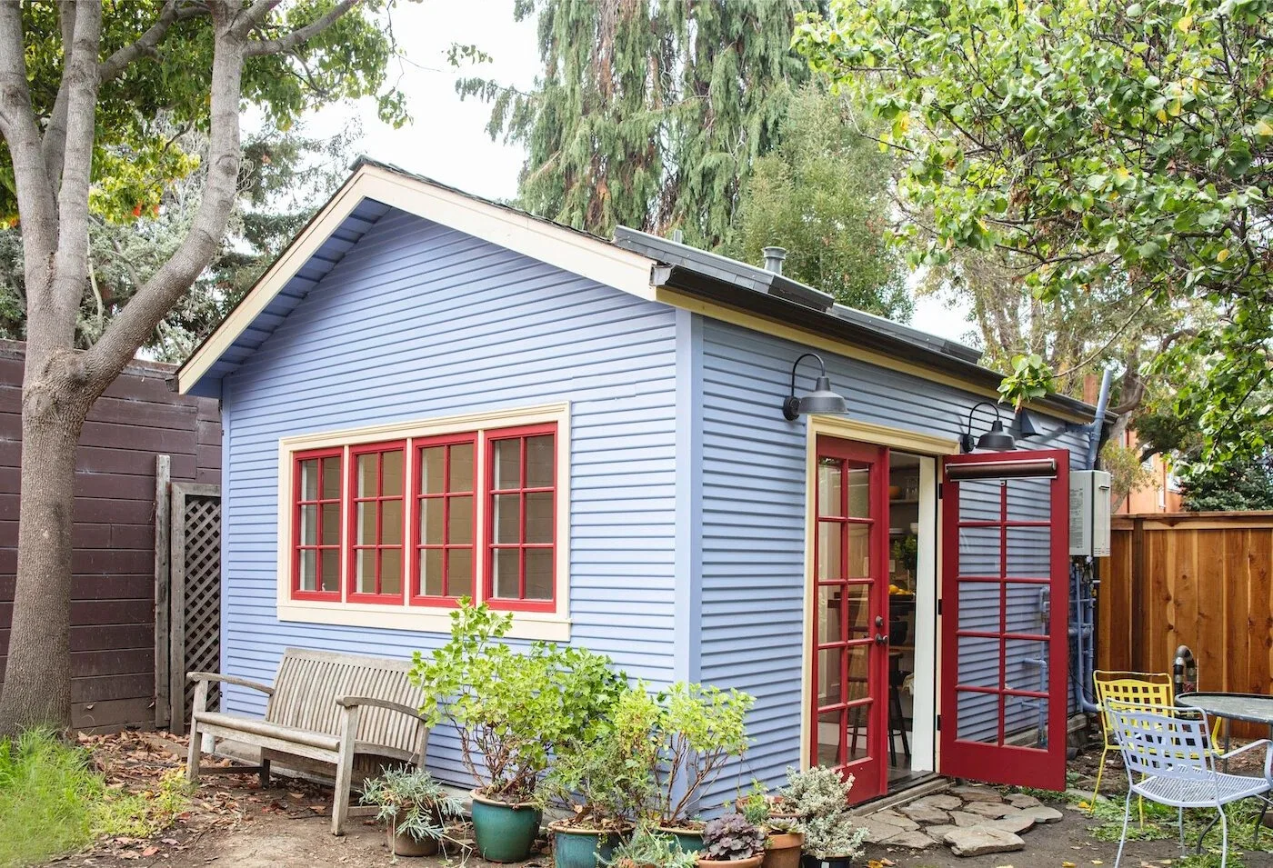
Light blue and apple red, olive greens, chocolate browns, and a range of other shades are gaining popularity as they have more depth and excitement to them. That doesn’t mean you have to forgo neutrals completely, but infusing a home with a new color can take it from fleeting trend to intrigue with longevity.
Embrace Interesting Layouts
Just because a floor plan works for one dweller, doesn’t mean it’s the right one for you. Consider your own needs and those of your family or the people who share your home. An interesting layout can both add character and offer more functionality.
A client of ours had a layout that encouraged multipurpose use and closeness, but it felt cramped and wasn’t quite right for them. Instead, we expanded the space and made designated areas for dining, entertainment, cooking, and relaxing. It still allowed them to spend time together but it better fit the family’s needs.
Ready to create a home that Uniquely yours?
Inspired to create a home with character and individuality? At HDR Remodeling, we design and build thoughtful, personalized spaces that feel timeless, functional, and unmistakably yours. Contact us to begin the conversation.
Smart Kitchen Features Worth Investing In
Holiday-Ready Upgrades to Make Cooking, Hosting & Gatherings Easier
The holiday season is around the corner, and for many households, that means one thing: the kitchen becomes the heart of the home. From early-morning prep to Thanksgiving dinner and everything in between, your kitchen works overtime this time of year. And while great recipes bring meals to life, the right features can make the entire experience smoother, smarter, and far more enjoyable.
Whether you're hosting a full house or just looking to streamline your everyday routine, incorporating these smart upgrades into your kitchen remodel are worth the investment—during the holidays and long after the leftovers are gone.
Touchless Faucets: Clean Hands, Cleaner Workflow
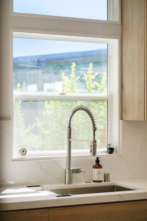
When you're rinsing turkey brine or moving between chopping vegetables and checking the oven, the last thing you want is to spread mess onto your fixtures. Touchless faucets make holiday prep so much easier. With motion-activated technology, you can wash hands, fill pots, or rinse produce without juggling knobs with messy fingers. They promote cleanliness, convenience, and conservation—three essentials during a busy cooking season.
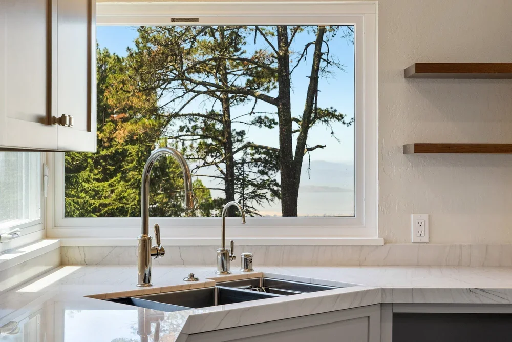
Additionally, two faucets offer even greater efficiency. The primary faucet provides convenience for washing, filling pots, and quick cleanup, while the secondary faucet can be dedicated to tasks like filtering water, prepping ingredients, or serving as a convenient bar/prep faucet when you’re hosting guests. Together, they support a smoother workflow, allowing multiple tasks—or even multiple cooks—to happen at once.
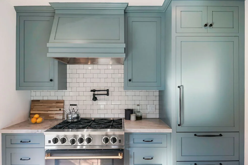
And for those who want to take kitchen convenience even further, pot fillers are another smart feature worth considering. Installed near the stove, a pot filler brings water directly to your cookware, eliminating the need to carry heavy, water-filled pots across the kitchen. It’s a small addition that makes a big difference—especially when you’re filling large stockpots for soups, pasta, or that holiday turkey brine.
App-Connected Appliances: Your Kitchen, on Command
Smart ovens, fridges, and dishwashers are more than trendy tech—they're game-changers during the holidays.
Imagine:
Preheating the oven from the grocery store
Getting an alert on your phone when the roast hits the perfect temperature
Checking fridge inventory while planning your Thanksgiving menu
App-connected appliances help you multitask effortlessly and keep the holiday chaos to a minimum.
Voice-Controlled Assistants: Hands-Free Help When You Need It
Timers, conversions, recipes, reminders—your voice assistant becomes your sous-chef during the holidays.
Ask it to:
Set multiple timers for different dishes
Convert cups to ounces
Add butter or spices to your shopping list
Play your favorite holiday cooking playlist
When your hands are full (or covered in flour), voice control is a lifesaver.
Smart Storage & Organization Accessories
You’ll thank yourself later for investing in smarter storage. Custom drawer inserts, expandable shelving, pull-out trays, and corner solutions help keep everything accessible—especially when you’ve got extra holiday cookware in rotation.
During Thanksgiving, when you're reaching for roasting pans, spices, Tupperware, and serving platters, organization becomes just as important as the food itself.
The holidays naturally highlight how your kitchen works—and where it could work better. These smart upgrades improve efficiency, enhance safety, and make cooking (and hosting!) more enjoyable. Even better, they continue to add value long after the holiday décor is packed away.
If you’re spending more time prepping, baking, and gathering in the kitchen this season, now might be the perfect moment to give yourself the gift of smarter, easier, more intuitive cooking.
Ready to Upgrade Your Kitchen?
If you're inspired to elevate your kitchen with smart features, thoughtful design, or a full remodel, HDR Remodeling is here to help. Our team specializes in creating beautiful, functional spaces tailored to how you live, cook, and gather.
Contact HDR Remodeling today to start planning your dream kitchen. Let’s bring your vision to life.
Expanding Your Home: Creative Ways to Add Space and Value
Transform Underused Areas into Functional, Beautiful Living Spaces
Looking to create more room for family, guests, or new possibilities? Thoughtful home additions and remodels can transform underused areas into functional, stylish spaces that enhance comfort and value. From expanding your layout to creating multi-purpose living areas, thoughtful home additions can transform the way you live.
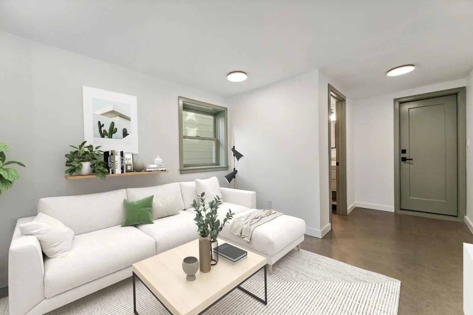
Adding a sunlit bedroom to transforming your basement or garage into a functional living area—or building a detached ADU for added flexibility are a few ways to expand your home’s livable space without compromising design or flow. Whether you’re adding room for family, guests, or new opportunities, explore design ideas that enhance comfort, improve flow, and increase your home’s value.
Bedroom Additions
A bedroom addition can feel like a natural extension of your home—seamlessly blending new and existing spaces to create comfort and flow. Whether it’s a private primary suite, a guest retreat, or extra room for a growing family, this addition expands the original square footage of your existing home and enhances both functionality and livability.
With attention to layout, lighting, and design details, your new bedroom can offer comfort, privacy, and style while maintaining the character of your home.
Finished Spaces That Maximize Comfort
Basement Remodels
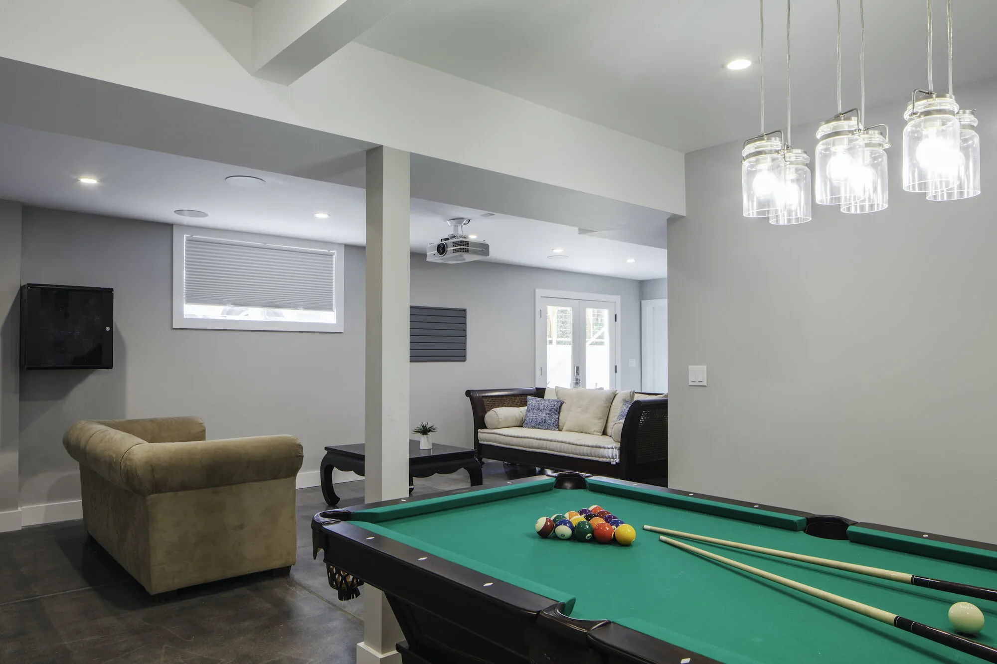
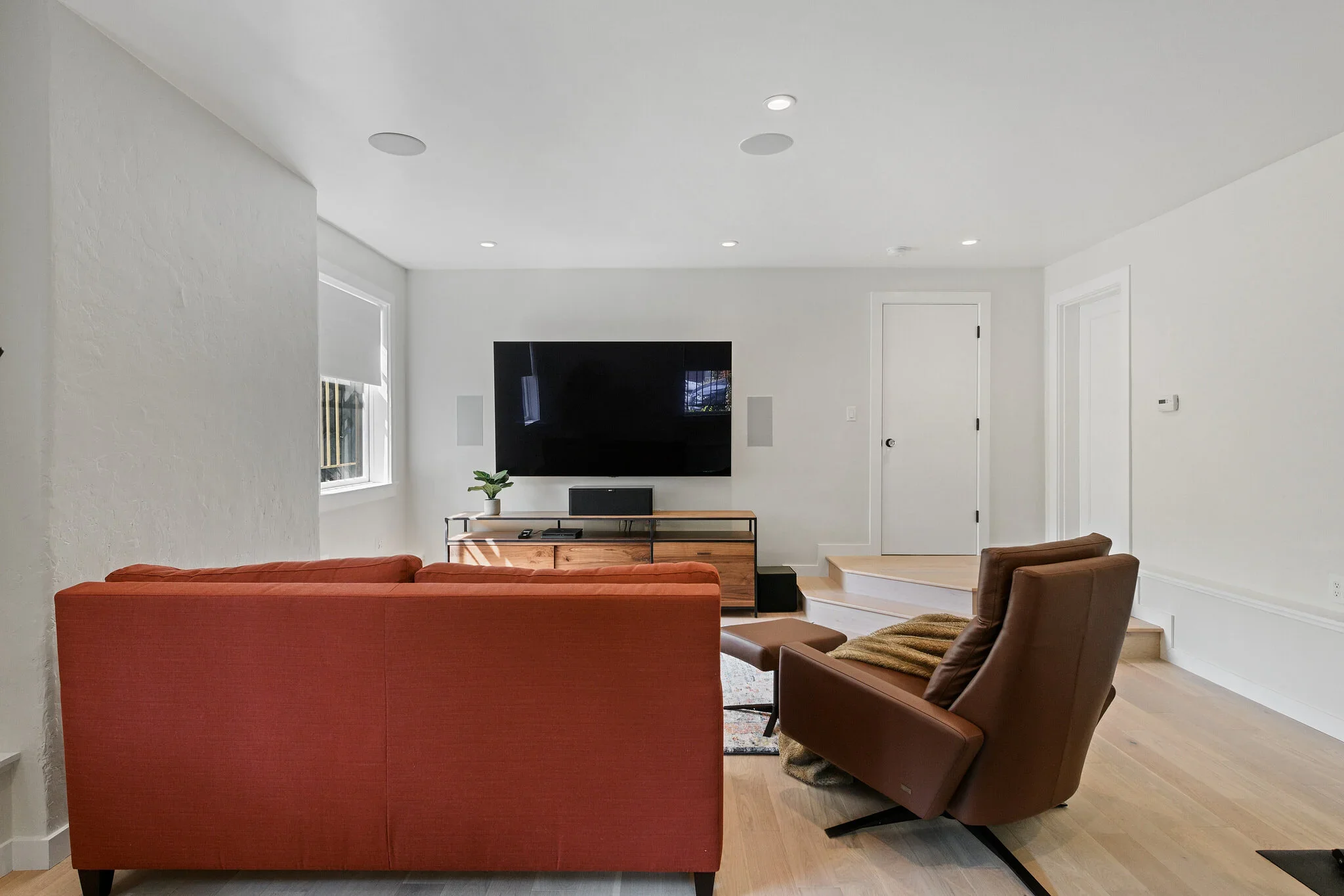
Transforming an unfinished basement into a livable, finished space is a smart way to expand your home’s functionality without altering its footprint. A well-designed basement remodel can serve as a cozy family room, an inviting guest suite, a home office, or an entertainment hub—tailored to fit your lifestyle. With thoughtful design and quality finishes, this once-overlooked area becomes a seamless extension of your home’s living space. With careful attention to lighting, layout, and finishes, this space can become a polished, inviting extension of your home that balances comfort and style.
Garage Remodels
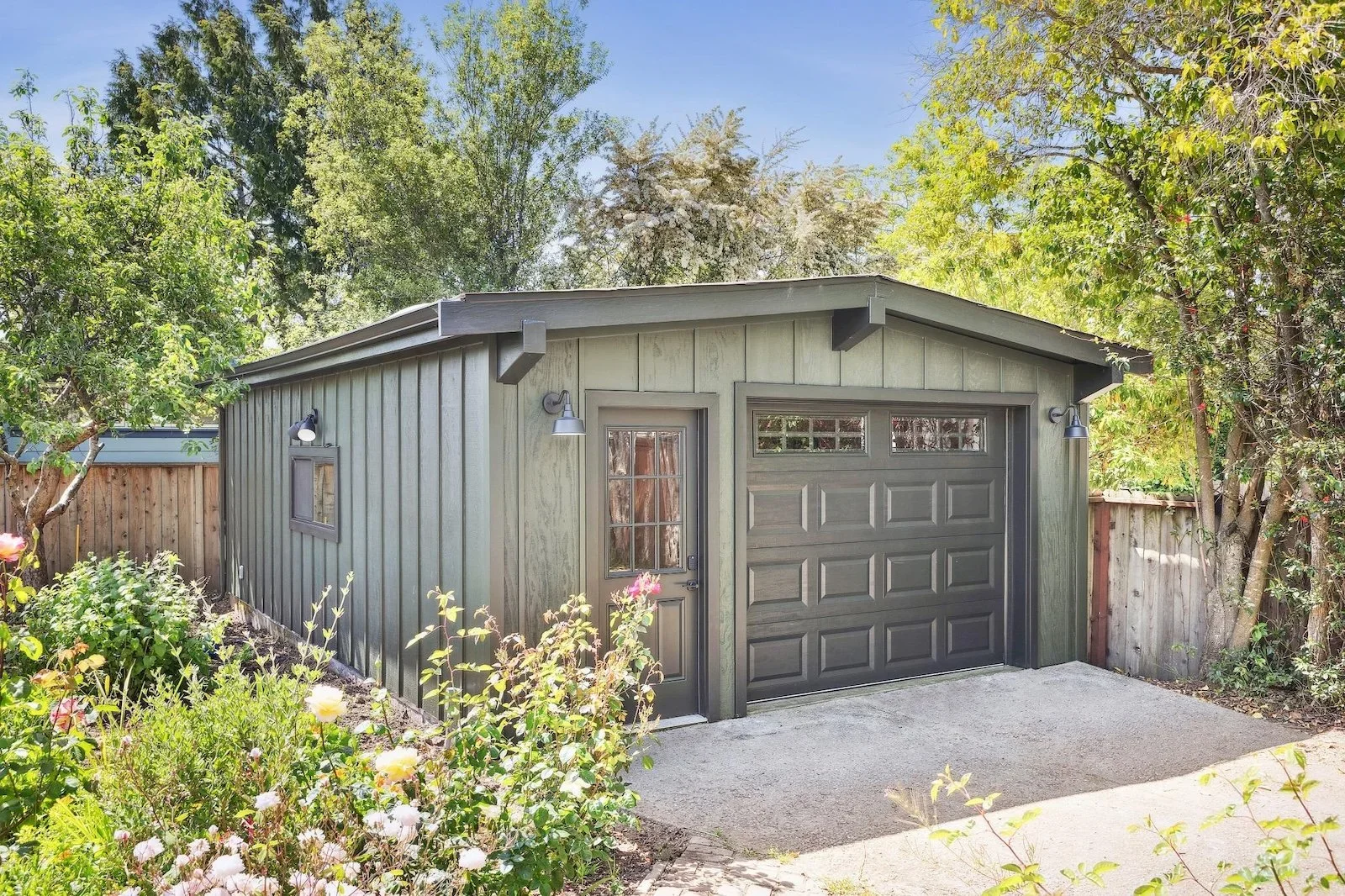
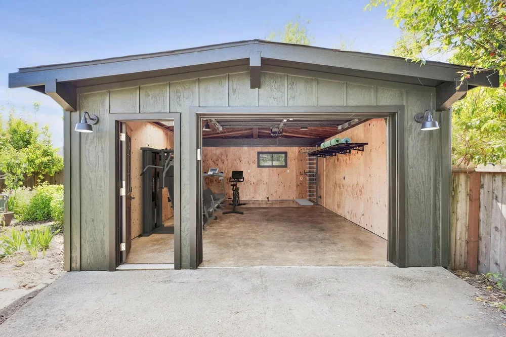
Similarly, a finished garage or garage conversion offers another opportunity to maximize your home’s potential. From a private studio or creative workspace to a home gym or entertainment zone, a converted garage provides flexible solutions for your evolving needs, delivering the same comfort and polish as a finished basement. With the right design approach, this space can be seamlessly integrated with your home, adding versatility and value to your home.
Accessory Dwelling Units (ADU):
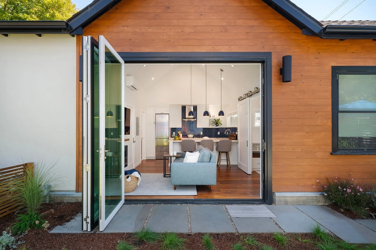
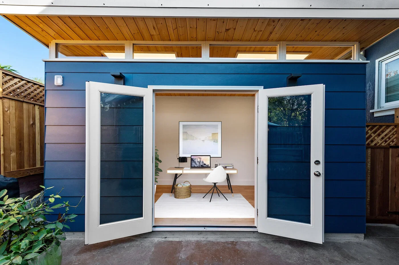
Adding an ADU is a transformative way to expand your home’s livable space while introducing independent functionality. Whether used as a rental suite, a home office, or a multigenerational living space, a well-designed ADU maximizes both comfort and privacy. From architectural cohesion with your existing home to modern interiors that prioritize livability, ADUs provide flexibility, enhance property value, and create new opportunities for living, working, or entertaining.
No matter your home’s layout or size, there are creative ways to expand your space and elevate your lifestyle. Explore design solutions that turn unused or underutilized areas into beautiful, functional extensions of your home—crafted to meet your family’s needs today and in the years ahead.
7 Ways to Bring Out Historic Features in a Modern Kitchen
A historic kitchen remodel can be one of the most rewarding projects you take on in your home. It allows you to preserve the character and charm of your space while upgrading it with the modern kitchen design elements you need for everyday living. The challenge, of course, is blending old and new in a way that feels cohesive and functional — without losing the unique soul of your home.
At HDR Remodeling, we work with homeowners every day to strike this delicate balance. The key is knowing which historic elements to preserve, which to modernize, and how to blend them into a seamless, beautiful design.
If you’re planning your own kitchen remodel, here are seven expert tips for highlighting historic features while creating a kitchen that works for the way you live today.
1. Celebrate Existing Materials
A kitchen remodel that blends historic and modern design creates a space that feels timeless, functional, and deeply personal. By celebrating original materials, preserving key details, and adding intentional updates, you can create a kitchen that’s as beautiful as it is practical.
Original materials are the soul of a historic kitchen — so let them shine. Whether it’s hand-hewn wood paneling, stone masonry, or brickwork, preserving these features adds instant charm and authenticity.
In our Summit Berkeley kitchen remodel, we preserved the home’s original wood paneling and designed modern cabinetry and appliances around it. The result? A kitchen that feels warm, authentic, and completely functional.
2. Preserve Architectural Details
Sometimes the most meaningful elements aren’t the finishes at all, but the bones of the space — windows, beams, flooring, and trim. Keeping these intact while updating the kitchen can create the perfect marriage of past and present.
One remodel we worked on retained the home’s original windows and hardwood floors while opening the kitchen layout and modernizing the finishes. The result was a bright, functional space that still felt rooted in the home’s history.
3. Showcase Unique Features
If there’s a one-of-a-kind feature you adore — like vintage tiles, a butler’s pantry, or a quirky built-in — make it a centerpiece rather than hiding it away. These details are what make your home truly special.
Our Windward Hill Berkeley kitchen embraced Deco-style railings and colorful vintage tiles — turning them into defining design features that make the space unforgettable.
4. Use Subtle Nods to the Past
You don’t have to fully recreate a historic style to honor it. Even in a modern kitchen, you can incorporate small, intentional touches that reference your home’s era.
In one project, a contemporary kitchen nodded to its mid-century roots with avocado-green backsplash tiles, warm wood accents, and period-inspired furniture — achieving a fresh, timeless look with just the right hint of retro.
5. Balance Function, Style, and Originality
When renovating, consider how you use the space day-to-day. Your kitchen should work for you — while still respecting the home’s character.
A great example is a 1920's Mediterranean Revival kitchen we redesigned. While the original layout didn’t meet the homeowner’s needs, we opened up the space and added custom cabinetry for function — while retaining vintage charm through a carefully chosen color palette and warm brass hardware.
6. Modernize Without Erasing
Preserving charm doesn’t mean keeping outdated or unsafe features. When something needs replacing, choose modern pieces that echo the original style.
In a 1920s farmhouse remodel, we leveled the floors and sourced wood species to match the originals. The result was a fresh, functional open-concept kitchen that still celebrated its rustic roots with a wood island, vintage-style pendants, and farmhouse cabinetry.
7. Source with Intention
Thoughtful sourcing can make all the difference. Take time to hunt for materials and fixtures that complement your home’s history — whether that means reclaimed wood flooring, antique lighting, or retro-inspired appliances.
This 1920s Berkeley kitchen remodel came with one essential request: that the flooring in the kitchen matched the original flooring around the rest of the house. HDR Remodeling found red oak flooring to perfectly match the rest of the home, preserving continuity and maintaining a meaningful connection to the past.
Your Kitchen Can Honor the Past — and Work for the Future
Blending historic charm with modern function doesn’t just create a beautiful kitchen — it creates a story, one that honors where your home has been while supporting how you live today. With careful planning and thoughtful design, you can achieve a kitchen that feels both timeless and entirely your own.
Ready to start your own historic kitchen remodel? The HDR Remodeling team specializes in transforming kitchens while honoring the character of your home. Contact us today to schedule a consultation and discover how we can bring your vision to life.
Shower Design Options: Styles, Features, and Ideas for Your Bathroom Remodel
When remodeling your bathroom, the shower is one of the most important design decisions you’ll make. It's not just about how it looks — the right shower design enhances functionality, comfort, and even resale value. Whether you're deep into planning or just gathering ideas for your dream bathroom, it’s worth taking the time to think about the different design directions your shower could take — and the little details that can make a big impact.
From beautiful tile choices to open-concept wet rooms, here’s a look at some of the most popular (and practical) shower design options to inspire your project.
Shower Styles to Consider
European Showers
If you love a sleek, minimal look, a European-style bathroom might be perfect for you. These showers skip the traditional shower door enclosure — just clean lines and open space, creating a more seamless, airy feeling in the bathroom.
Why we love it: Wet rooms feel airy and modern, and they’re easier to clean since there are fewer joints and corners for grime to hide. They're also a smart way to maximize space in smaller bathrooms.
Shower and Bathtub Rooms
Want the best of both worlds? Imagine stepping into a fully waterproofed space where a freestanding tub and open shower share the same area — it’s like bringing a spa retreat into your own home. This is essentially a bathing area that features a freestanding bathtub inside a walk-in shower.
Why we love it: Combining a tub and shower in one open room feels indulgent and luxurious. Plus, it creates a dramatic, high-end look, especially in larger bathrooms.
Alternatively, a free-standing bathtub and separate shower stall can also present a luxurious feel without the wet room.
Walk-in Showers
Walk-in showers are a classic choice for a reason. With no threshold (or a very minimal one), they offer easy access and a clean, streamlined look. If you’re remodeling with long-term comfort and safety in mind, designing a walk-in shower with grab bars, built-in benches, and handheld shower heads features is a smart move.
Why we love it: Walk-in showers are easy to clean and endlessly customizable. They work beautifully in almost any bathroom size and style. They’re especially popular for homeowners planning ahead for aging in place, thanks to their accessibility.
Bathtub-Shower Combos
If you want the option of a relaxing soak and a quick rinse, a traditional bathtub-shower combo is a smart, versatile choice.
Why we love it: Perfect for households with kids, guests, or anyone who loves a good bubble bath. Plus, keeping a tub in at least one bathroom can help with resale value down the road.
Shower Features That Elevate
From functional features designed beautifully to a focal point with intricate shower tiles or a statement wall, make a beautiful design statement to elevate your bathroom.
Built-In Niches
Say goodbye to cluttered corners and hanging caddies. A built-in shower niche gives you a clean, stylish way to store shampoos, soaps, and other essentials.
Pro tip: Frame your niche with an accent tile or border to turn it into a design feature!
Benches and Seating
A bench can transform your shower into a true retreat. Whether it’s for relaxation, convenience, or accessibility, adding seating is a practical luxury you’ll appreciate every day.
Options:
Multiple Shower Heads
Take your daily routine to the next level with a combination of a rainfall showerhead, handheld sprayer, or body sprays to make your experience feel truly spa-like.
Customization options: Install dual controls so two people can shower comfortably at the same time — or set up different temperature and pressure settings for ultimate comfort.
Tile Choices
Tile sets the tone for your entire shower. Whether you want the timeless look of marble, the sleekness of large-format porcelain, or the playful personality of mosaic accents, the options are endless.
Heated Floors
If you’re already redoing your bathroom floors, consider adding radiant heating under the tile.
Why it’s worth it: Stepping onto a warm floor after a hot shower feels like a spa experience — and it helps your bathroom dry out faster, too.
Steam Showers
For the ultimate spa-like upgrade, a steam shower creates a wellness retreat right at home.
Considerations: Steam showers require specific enclosures and waterproofing, but they offer amazing health and relaxation benefits if you love the idea of a sauna experience.
Fixtures and Hardware
The right fixtures can take your shower from standard to standout.
Ready to Design Your Dream Shower?
No matter your style — cozy and traditional, clean and modern, or spa-inspired luxury — we’re here to help you create a bathroom you’ll love for years to come.
Take a look at our Bathroom Portfolio to get inspired, and contact us today to start planning your remodel!
Transform Your Backyard - 7 Ideas for Creating an Outdoor Oasis
Your backyard has the potential to be more than just an outdoor space—it can become a relaxing retreat, an entertainment hub, or a functional extension of your home. There are many ways you can improve your backyard, whether through landscaping, furniture design and layout, or creative lighting. Here are seven ways to make the most of the exterior space you have and turn it into a place you’ll love to spend time in.
1. Enhance Your Landscape with Drought-Tolerant Design
A well-planned landscape design can completely transform your backyard, creating a beautiful and functional outdoor space that thrives in the Bay Area’s unique climate. One of the best ways to achieve a low-maintenance yet stunning yard is by incorporating drought-tolerant landscaping and native plant species. By choosing plants that are well-adapted to the region—such as California poppies, manzanita, and lavender—you can reduce water usage while maintaining a vibrant and inviting outdoor space.
Sustainability and eco-conscious gardening are also top of mind for us, whether that’s creating wildflower gardens, curating native varieties, and selecting low-water and low-maintenance plants. Strategic hardscaping elements, like permeable pathways and natural stone features, can further enhance both the aesthetic and sustainability of your backyard.
2. Expand Your Outdoor Living Space with a Custom Deck or Patio
Adding a decor patio is one of the most impactful ways to enhance your backyard, creating a versatile outdoor living space that extends your home’s functionality and style. Whether built as an extension of the first or second floor, a well-designed deck or patio can serve as the foundation for a variety of outdoor features that elevate comfort and entertainment. From integrated seating areas that maximize space to built-in fireplaces that provide warmth on cool Bay Area evenings, the possibilities for customization are endless.
or homeowners who love to entertain, incorporating a built-in kitchen or grilling station can turn a simple deck into the ultimate outdoor gathering spot. Durable materials like composite decking and natural stone not only add to the aesthetic appeal but also ensure longevity and low maintenance.
3. Elevate Entertaining with an Outdoor Kitchen and Dining Area
An outdoor kitchen and dining area can turn your backyard into a true extension of your home, offering a perfect space for cooking, dining, and entertaining year-round. Whether you’re hosting a summer barbecue, enjoying a quiet family dinner under the stars, or gathering friends for a casual weekend brunch, a well-designed outdoor kitchen provides both convenience and luxury. Features like built-in grills, pizza ovens, refrigerators, and prep stations allow for seamless outdoor cooking, while thoughtfully designed dining areas with pergolas, lighting, and weather-resistant seating create an inviting atmosphere.
From sleek modern designs with stainless steel appliances to rustic, Mediterranean-inspired setups with stone countertops and wood-fired ovens, our team can help you create an outdoor dining experience that enhances your backyard, aligns with your family's lifestyle, and elevates your home’s value.
4. Create Seamless Indoor-Outdoor Living Spaces
Blurring the lines between your home’s interior and backyard can create a harmonious flow that makes your living space feel larger and more connected to nature. Indoor-outdoor spaces take advantage of the Bay Area’s mild climate, allowing homeowners to enjoy fresh air and natural light year-round. Large sliding or folding glass doors, covered patios, and extended living areas help integrate the two environments, making your backyard feel like a natural extension of your home.
Thoughtful design elements like matching flooring materials, integrated lighting, and strategically placed landscaping can further unify the spaces, creating a cohesive and inviting atmosphere. Whether it’s a sunroom with retractable walls, a covered deck with cozy furnishings, or a patio designed as an extension of your living room, our expert team ensures a seamless transition between indoors and out.
5. Maximize Your Space by Adding an Accessory Dwelling Unit (ADU)
If you’re looking to expand your home’s functional space without altering its existing footprint, adding an Accessory Dwelling Unit (ADU) is a smart and versatile solution. Whether used as a guest house, home office, rental unit, or private retreat, an ADU allows homeowners to maximize their backyard square footage while increasing property value. These standalone or attached structures blend seamlessly with the main home and can be designed to complement indoor-outdoor living by incorporating large windows, sliding doors, and outdoor patios.
6. Make Your Backyard an Oasis with Multipurpose Zones
Creating distinct zones in your backyard is an excellent way to maximize functionality while maintaining a cohesive and visually appealing design. By thoughtfully dividing your outdoor space into designated areas—such as a dining zone, a lounge space, a fire pit area, or a garden retreat—you can make your backyard feel like a true oasis. Each zone can serve a specific purpose while seamlessly blending with the overall design, making your outdoor space more enjoyable for relaxation, entertainment, and everyday living.
Whether you want a cozy reading nook with lush greenery, a dedicated kids' play area, or a stylish entertainment hub with built-in seating and lighting, thoughtful design elements like pergolas, pathways, outdoor rugs, and smart landscaping help define each zone while maintaining a natural, open flow. By integrating these features, we transform outdoor spaces into functional, stylish retreats that enhance both the beauty and usability of your home.
7. Create a Wellness Corner
Studies show that being out in nature can reduce cortisol and lower your stress, so why not implement your wellness practices in the greenest space you have? Whether you enjoy meditation, yoga, or simply soaking up the sun surrounded by greenery and fresh air, consider carving out a corner of your garden or backyard for these mindful moments.
This dedicated space can serve as your personal retreat, designed to promote physical and mental health through the calming presence of nature. Imagine a tranquil corner surrounded by lush greenery, soft lighting, and natural elements like stone, water features, and plants that foster peace and relaxation. Incorporating features such as a yoga deck, a meditation space, or a hammock can help you unwind and reconnect with yourself amidst the beauty of your outdoor environment. A water feature is often a nice touch for added ambience.
A beautiful perk of living in the Bay Area is the ample time we get throughout the year to enjoy these outside spaces. Your backyard should reflect this and include design features that make it easy to catch the morning sun and to lounge in the shade on a warm day.
At HDR Remodeling, we specialize in designing and building landscapes that align with the Bay Area’s climate while reflecting our clients’ personal styles. Our expert team carefully selects native plants and drought-friendly materials to create a backyard that is both environmentally responsible and visually appealing.
We believe in creating spaces that support wellness and provide sanctuary from the stresses of everyday life. HDR Remodeling ensures a seamless blend of beauty, functionality, and sustainability in every project.
With a focus on sustainability, we incorporate energy-efficient materials, smart storage solutions, and natural lighting to create a livable and inviting space. By carefully designing features with your lifestyle in mind, we ensure that your backyard is not just a beautiful outdoor space but a true oasis to rejuvenate, relax, and find balance.
If you're ready to transform your backyard into a space you’ll love to spend time in, contact us today to start planning your dream outdoor retreat!
Design Build vs. Traditional Remodeling: What’s the Difference?
Homeowners eager to embark on a rewarding home remodeling journey may be ready to dive right in. However, before hiring a team, it's essential to understand the key differences between the two most common renovation approaches: Design Build and traditional remodeling, often referred to as design-bid-build.
As you research your options, these two methods will likely stand out as primary pathways to achieving your ideal home renovation. We're here to break down how each process works, highlight their respective advantages and challenges, and explain why Design Build has become the preferred choice for many homeowners today.
A Look at the Traditional Remodeling Process or Design-Bid-Build
One of the most common and traditional remodeling methods is design-bid-build. In simple terms, this approach requires working with at least two separate companies: one for the design phase and another for the construction and implementation.
With this project delivery method, you’ll review bids from multiple contractors and select one for each stage of the process. This gives you direct control over who designs your remodel and, separately, who builds it.
Costs can vary, often increasing if multiple design revisions are needed. In some cases, you may secure a lower overall price by focusing on competitive bids and selecting the lowest offer. However, this approach prioritizes upfront cost savings over ensuring a high-quality execution of the design.
A Look at the Design Build Remodeling Process
The Design Build process eliminates the need to source multiple contractors for different project phases, instead keeping both design and construction under one company’s umbrella. In fact, some of the most iconic structures—like the Parthenon and the Pentagon—were built using a Design Build approach.
This method has grown in popularity for several reasons, starting with its streamlined structure. With fewer steps, teams, and contracts to manage, Design Build fosters communication and provides homeowners with greater transparency, insight, and control over the project’s execution. Since one cohesive team handles both design and construction, there’s no risk of misalignment between designers and builders, avoiding conflicts that can arise in traditional design-bid-build projects.
While the disadvantages of this approach are relatively minimal, there are a couple of factors to consider. Without multiple bids or separate contracts, Design Build doesn’t emphasize cost-cutting in the same way as design-bid-build. However, this doesn’t necessarily mean it’s more expensive. The key is choosing a firm you trust, as they will be solely responsible for every aspect of your project.
Comparing Traditional vs. Design Build Remodels
The most obvious difference between design-bid-build and Design Build is the project structure. Design-bid-build relies on a bidding model and multiple contractors who may not have prior relationships with your design team, while Design Build keeps the entire project in-house from start to finish. However, beyond this key distinction, there are also more nuanced differences when you break down each process.
Advantages vs. Disadvantages
The table below gives you a quick summary of the perks and downsides of both design build and design-bid-build processes when it comes to specific parts of your remodel.
| Comparison | Design Build | Traditional (Design-Bid-Build) |
|---|---|---|
| Efficiency | With a unified team, everyone remains informed throughout the entire process—aware of setbacks, costs, designs, and materials, regardless of their specialty. This transparency enhances efficiency and minimizes obstacles. Additionally, projects benefit from greater flexibility since a single team manages the entire operation, eliminating the need to coordinate between multiple groups. |
Traditional models can be efficient when all parties collaborate effectively and adhere to the same timeline. As the homeowner, you play a crucial role in maintaining efficiency, acting as the primary liaison between contractors. While this can be rewarding if you thrive on responsibility and decision-making, it can also be overwhelming and stressful. |
| Cost | Design Build can be cost-effective because the design and construction teams work together to ensure the vision is both practical and achievable, reducing costly revisions and delays. | Design Build can be cost-effective and more competitive, as collaboration between design and construction helps streamline the process. However, it can also carry risks, such as unexpected change orders that may impact the budget and timeline. |
| Communication | Communication tends to be more seamless with Design Build, as a single team oversees both design and construction. While there may be specialized sub-teams involved, the entire project remains under the responsibility of one company, ensuring greater cohesion and efficiency. | Communication can be more challenging with design-bid-build, as separate contractors handle different phases of the project. This can lead to disagreements, misalignment, and even situations where parties shift responsibility or costs onto one another. |
| Timeline | As a unified team, Design Build remodelers work seamlessly within a single timeline. While delays can still occur, everyone remains aligned throughout the project, ensuring smoother coordination and accountability from start to finish. | In a Design-Bid-Build approach, you and your chosen contractors must carefully coordinate timelines. Typically, design drawings must be finalized before you begin searching for a general contractor. Any delays can be more disruptive compared to the seamless workflow of the Design-Build method. |
| Risks | With Design Build, homeowners carry significantly less risk. The firm handles all responsibilities, including budget allocation and problem-solving if issues arise. While you'll stay informed, you won’t have to manage multiple contractors or navigate complex decisions on your own. | With design-bid-build, homeowners take on more risk due to the need to manage separate contracts. You'll be responsible for overseeing budgets, timelines, and any issues that arise throughout the project. However, this also provides a bit more control over contractor selection and decision-making at each stage. |
What to Consider When Hiring a Team
Choosing the right firm for your home project is a decision that shouldn’t be rushed, and there’s no one-size-fits-all answer. Once you’ve narrowed down your options, there are a few key factors to consider.
Start by reviewing each firm’s portfolio. Look for alignment with your desired design style and a proven ability to complete projects of a similar scale and complexity. For example, HDR Remodeling specializes in custom designs for historic homes throughout the Bay Area, preserving each home’s unique character.
Equally important is understanding how the team communicates and what level of involvement they expect from you. Are they transparent about timelines, contracts, costs, and project plans? Do you feel comfortable engaging with them and asking questions? It’s also helpful to learn about the systems they use and their overall process to ensure a smooth and collaborative experience.
FAQs
If you have any lingering questions, these answers should provide clarity before you begin working with a professional team.
What is the difference between Design Build and design-bid-build?
Design Build is a remodeling process where both design and construction are managed by a single firm, offering a more streamlined approach. In contrast, design-bid-build involves two separate contracts, typically with different companies—one responsible for design and the other for construction.
Does Design Build or design-bid-build take longer?
The timeline for a project depends on its scope and requirements. In general, when comparing the same project through both Design Build and design-bid-build approaches, Design Build typically has a shorter timeframe. This is because the entire project is planned under a single timeline and collaborative contract, whereas design-bid-build involves managing multiple contractors’ availability and timelines, which can introduce delays.
Does Design Build or design-bid-build cost more?
Design Build contracts are often less expensive because a single team is responsible for the entire project, streamlining costs and minimizing unexpected price increases. In contrast, with traditional design-bid-build, multiple teams are involved, which can lead to fluctuating costs and unanticipated rises in the overall price. While you might secure a lower-cost design-bid-build project by obtaining multiple competitive bids, this is not always guaranteed.
If you’re looking to make your design dreams materialize this year, contact our team to get more information on how we can help bring your vision to life.
8 Home Remodeling Design Trends We’re Predicting for 2025
With decades of experience and a team of seasoned architects and designers, we’ve harnessed their wealth of insights to forecast the top design trends for 2025. Our predictions are grounded not only in renovation data but also in a profound understanding of our clients’ evolving tastes—what speaks to their hearts, enriches their lifestyles, and meets their ever-changing needs.
As lifestyles transform and priorities shift, our forecast captures both the practical and the aesthetic elements poised to take the spotlight. And, of course, we’ve allowed ourselves a touch of creativity to imagine what’s just beyond the horizon. So, as 2025 approaches, here are eight design trends we believe will shape the year ahead.
1. Saturated & Bold Colors
In recent years, neutral palettes and subdued paint colors have taken center stage—a natural choice for those seeking to make their homes a sanctuary of calm and serenity. However, as we look ahead to 2025, we anticipate a shift toward richer, bolder hues taking their well-deserved spotlight.
While the timeless appeal of minimalist tones like cream, gray, and white will remain, homeowners are increasingly ready to turn up the saturation. Expect to see spaces enhanced with vibrant paints, striking tiles, and decor that adds personality and flair. Whether it’s in a bathroom or bedroom, color breathes life into a space, energizing it while offering a visually stunning element to enjoy every time you walk through the door.
2. Patterns & Textured Elements
As we step into the new year, we foresee a move away from flat, matte, and solid-colored surfaces toward those that showcase unique patterns and textures. This simple yet striking design choice can instantly refresh a room, adding depth and personality. From wallpaper and intricate tiles to murals, textiles, and artwork, the possibilities are virtually endless.
Think beyond the usual spaces, too—patterns can transform unexpected areas into design highlights. Tiled kitchens, wallpapered dining rooms, patterned guest bathrooms, and hallways all present opportunities to incorporate bold textures and eye-catching details, making these spaces as memorable as they are functional.
3. Arched Designs & Rounded Forms
Think back to the rise of cloud couches, curved furniture, and the embrace of soft, fluid shapes that defined 2020 and 2021. These trends are now evolving into enduring staples within home design.
Flowing, symmetrical forms like archways and rounded edges are inherently pleasing to the eye, often evoking a sense of calm and safety. Softer and more inviting than sharp angles and hard corners, they’re an ideal way to create a serene and welcoming environment. While these shapes may have started as experimental accents, they’re now taking on a more permanent role in homes—appearing as arched bookshelves, rounded entryways, circular light fixtures, and even built-in seating and windows.
4. Large Format Tiles
In 2025, penny tiles and smaller formats will take a back seat, making way for the bold statement of large-format tiles. These expansive tiles are set to dominate floors, walls, and even backsplashes, offering homeowners a wide array of colors, finishes, and materials to suit any aesthetic.
Visually, large-format tiles create a streamlined and serene look, perfect for simplifying a kitchen or bathroom design. Their minimalistic appeal balances out the textured busyness of smaller tiles while maintaining a sophisticated charm. Functionally, they’re just as impressive—covering more surface area means fewer grout lines and easier cleaning, a practical bonus for any space.
5. Multi-Use Flex Spaces
While open-plan spaces are making a comeback, the demand for privacy and dedicated areas for work or additional living remains strong. These spaces don’t always need to be within the main home, either. Increasingly, homeowners are embracing attached but separate rooms—or even fully detached units—that offer both flexibility and functionality.
Garages and custom-built accessory dwelling units (ADUs) are excellent options for creating versatile spaces around the home. Whether transformed into a gym, office, studio, media room, or hobby space, their true appeal lies in their endless customization potential. These add-ons can be tailored to meet virtually any need, making them a perfect solution for evolving lifestyles.
6. Age-in-Place Updates
These thoughtful changes and additions to living spaces can transform a house into a true forever home, designed for comfort and accessibility as you age. For many, the sense of security and belonging that comes from being at home is irreplaceable. That’s why we predict this trend will become a lasting staple in renovations, enabling homeowners to age in place with ease and dignity.
Practical implementations of this trend include replacing bathtubs with curbless showers equipped with seating, installing slip-resistant flooring, or upgrading door and cabinet handles to more ergonomic options. These modifications not only enhance safety and functionality but also ensure that your home continues to support your lifestyle for years to come.
7. Open Concept Rooms
Over the past few years, the trend shifted away from open-plan layouts as people sought privacy and separate spaces for work, play, and relaxation—a natural response to spending so much time at home. However, as we look ahead to 2025, we anticipate the pendulum swinging back toward open-plan designs. These layouts foster connection, making it easier to interact with family, entertain guests, and share a sense of togetherness, even when everyone is engaged in different activities.
The most popular transformations will likely include merging kitchen and dining areas or removing walls between living room and kitchens. These changes make perfect sense for creating welcoming, communal spots that bring people closer together.
8. Functional Kitchen Additions
A well-equipped kitchen makes cooking, entertaining, cleaning, and even working a seamless experience. As the long-standing “hub” of the home, it’s no surprise that kitchen remodels will remain a top priority in 2025, with a strong focus on functional upgrades.
This could include practical additions like pull-down faucets and larger utility sinks, traditionally found in mudrooms or laundry rooms, making their way into the kitchen. Expect to see a growing emphasis on cabinet and drawer organization, with systems designed to maximize efficiency and simplify everyday tasks.
Clients will also look to strike a balance between style and functionality. Cabinets, islands, and appliance garages will not only look stunning but also feature innovative systems, technologies, and layouts that enhance their utility. The result? Kitchens that are as practical as they are beautiful.
So, whether you’re drawn to bold, vibrant updates or functional, efficient improvements, now is the perfect time to kick-start your renovation or incorporate fresh design elements into your home. Reach out to our team to learn more about how we can bring your vision to life and transform your space into something truly extraordinary.
Kitchen Cabinetry 101: Your Guide to Cabinet Door Styles, Types, and Ideas
Cabinets are the heart and soul of a kitchen. They give homeowners precious storage and organizational space that keeps clutter at bay. Cabinets are also responsible for cultivating the wow factor that arises when you step into a beautifully-designed kitchen, thanks to the abundance of personal touches you can choose—whether it be a bold paint shade or a sleek handle style.
Key Factors That Influence The Costs of Remodeling
What to Consider When Budgeting For a Home Remodel
Renovating your home can be an exciting journey, and understanding the factors that impact renovation costs is essential to make the most of it. Whether you're planning a kitchen remodel, a bathroom transformation, or a complete home makeover, this guide will walk you through the main elements that influence remodeling expenses in the greater East Bay Area.
1. Home Size and Location
When renovating your home, both its size and location significantly impact costs. Larger spaces often require more extensive renovations, while smaller homes demand thoughtful, efficient design solutions. Location also plays a role, as each area may have unique building codes and permit requirements that add to expenses. Homes in challenging spots—like those on narrow, winding roads or with lots of stairs—can further increase costs due to added project time and complexity. By understanding how size and location affect your renovation budget, you’ll be better equipped to plan for a smooth, successful project.
2. Renovation Type
The type of home remodel you choose has a major impact on overall costs, as different projects vary in complexity and scope, affecting the labor, materials, and time required. For example, large-scale renovations—such as adding a new room or changing the layout—often require detailed planning, permits, and structural modifications, all of which can significantly drive up expenses.
Even seemingly straightforward projects, like a bathroom refresh with simple like-for-like replacements and no layout changes, require careful budgeting. Management fees, subcontractor costs, and the choice of quality materials can add up quickly. Additionally, even smaller projects often need professional oversight to ensure compliance with local building codes and standards. What may start as a minor update can easily become a larger investment, underscoring the importance of budgeting thoroughly for any renovation, big or small.
3. Labor
Labor is one of the most significant—and often overlooked—costs in home renovations. While materials are easily quantified, labor includes skilled services essential to bringing your vision to life. From Project Managers to specialized trades like electricians, plumbers, and carpenters, quality expertise is crucial for a successful renovation. Investing in skilled labor not only completes the project but ensures it's done right, enhancing the beauty and functionality of your space for years to come.
4. Materials
Materials are a key factor in determining the cost of your remodeling project. The quality and type of materials you choose can have a significant impact—premium options like natural stone or solid wood typically require a higher investment than budget-friendly alternatives. Additionally, the quantity of materials needed affects costs, as larger spaces demand more resources, making accurate planning essential. Some materials also come with complex installation processes, which can increase labor costs. Though certain materials may have a higher upfront price, investing in quality often leads to long-term savings and enhances your home's overall value.
5. Unexpected Costs
Every renovation project can come with unexpected surprises! Hidden damage, faulty wiring, or plumbing issues may reveal themselves once the work begins and the walls are opened up. To keep your project on track, it’s wise to set aside a contingency fund of about 10-15% of your total budget. This will prepare you for any unforeseen expenses that arise. By proactively addressing potential challenges, you can save both time and money!
6. Design
Hiring a professional designer may increase your initial costs, but it can significantly enhance the usability and aesthetic appeal of your remodeling project. A well-planned design can help prevent costly adjustments later, making it a worthwhile investment. Consider the advantages of a design-build firm like HDR Remodeling, which seamlessly integrates design and construction for a more efficient and cohesive experience.
7. Project Management
Collaborating with a Project Manager for your remodeling project brings numerous advantages that often far outweigh the costs. Their expertise and experience help navigate the complexities of renovations, preventing costly mistakes and ensuring a seamless process. Project managers efficiently coordinate communication between contractors, suppliers, and you, minimizing misunderstandings and keeping the project on track. By managing scheduling and logistics, they save you valuable time, allowing you to focus on other priorities. They also assist with budget management, offering transparency and identifying cost-saving opportunities without compromising quality. Additionally, project managers excel at problem-solving, proactively anticipating and addressing challenges. Ultimately, entrusting your remodeling project to a project manager can reduce stress and provide peace of mind, making the investment truly worthwhile.
Renovating your home is a significant investment, and understanding the various factors that influence costs can empower you to make informed decisions. At HDR Remodeling, we are dedicated to guiding you through every step of the process, helping to bring your vision to life while minimizing unexpected financial surprises along the way.
Learn More About Remodeling Costs
Case Study: A Modern and Spacious Home Addition That Encourages Indoor/Outdoor Living
Spaces that feel overworked or that fail to embody their full potential can leave dwellers feeling unexcited about their living situation. This was the case for our MLK Home Addition project. Our clients were unimpressed with an area off of the kitchen that had been designated both as a living and dining space, and were less than thrilled about their heat trap of a porch that by no means set the tone for spending time outdoors. Ideally, they needed more interior and exterior square footage that was functional but also appealed to their modern tastes.
The Existing Design
Inside, the home had an open plan kitchen that led directly into a dining-meets-living-room area. The space was somewhat of a chameleon, morphing between a dining area, a space to hang out, and a crafting zone, among other things. Although it sounded nice in theory, it was too small of a spot to have so much going on. Dedicated portions for each of these activities were needed. Additionally, the home also had an outdoor porch area that felt crowded and overheated due to the direction it faced. The uncomfortable temperature often seeped indoors, too, proving the exposure and overall design of the space needed work.
Challenges within the Space
From this overview, we compiled a handful of specific pain points we wanted to address for our clients’ renovation:
- No dedicated living room: The clients’ current space was a multi-use room, which meant their room for relaxing and entertaining was the same space they would dine.
- No dedicated dining room: The other half of the living room conundrum was that there was also no dedicated space for dining and sharing meals. This also blended right into the kitchen.
- Unusable porch: The area trapped too much heat and wasn’t a comfortable space to spend time in.
Our Solutions
After reviewing the design challenges, it was clear an extension would be necessary as would room conversions. Our team drafted up plans and came up with the following solutions for improving both the indoor and outdoor spaces:
Dining and Living Room Solution
- Convert the porch: This too-hot outdoor space would become a cooler, more spacious interior room that would now serve as the dining area.
- Take advantage of additional unusable outdoor space: Our team would extend the home into this extra outdoor space that wasn’t serving our clients. This would become a brand new living room. Even better, it would lead out into the more comfortable outdoor living space with a seamless transition.
Porch and Outdoor Living Solutions
- Move the location: The best fix for this unideal porch was completely relocating it. Now, the outdoor space would sit on the other side of the yard. It’s still a bright area for getting fresh air, but it didn’t have the same southern exposure to sunlight that was making the existing porch so uncomfortable.
- Change the entrance point: With the relocation of the outdoor living area, the entrance point also needed to be moved. It would now sit and face the north as opposed to sitting in the blaring hot sun coming from the south.
The Results
Our clients’ overworked dining-living area combo and their overheated porch were reimagined and materialized into a brand new layout. Their home now has a stretch of living space that completely separates out the dining and living room areas, giving them ample room to relax far from the spot where they share meals.
Replacing the sweltering porch is a breezy patio on the other side of their yard that’s outlined with a sleek wooden trellis. With the floors leveled out and ceiling height measurements taken, the two spaces now also blend seamlessly into one another, making it incredibly simple to float between their home and patio.
Bigger and Brighter
Aesthetically, one of the most noticeable differences was how much bigger the space felt (and was) with the expansion. This was only enhanced with the help of hidden recessed lights and wall wash lights and the hiding of electronic wires and cables. The bright white paint helps it feel modern and airy, but the warm wood tones ground the space and ensure it still feels welcoming.
Seamless Indoor-Outdoor Living
The client wanted a clear view of their backyard, which was made possible through cantilever corner windows and consistent flooring that hugged both spaces. Not only would they have an unobstructed view, but the border between outdoor and indoor spaces was left less obvious. This intentional move allows our clients to embrace the great outdoors and have a better flow between spaces rather than hard barriers. Subtle colors and natural materials added to this feeling of seamlessness, helped through the pebbled concrete floor that connected the patio and living room and the wooden touches that were a nod to the nature outside.
Comfortable Communal Spaces
Originally, the dining room had felt cramped and dark. It was far from the inviting room our clients envisioned. Despite the floorplan, it felt disconnected and dim. This one area was also overwhelmed with multiple purposes, from crafting to eating to lounging. After the renovation, the space was opened up and separated into two different areas. There was a spacious and modern living room with a comfy L-shaped couch that looked directly out onto the new patio. Back towards the kitchen, there was a new designated dining area. These spaces still encouraged the family to be together, but not in such close quarters.
Modern Touches and Updates
There are other design details that were incorporated from the back dining room through to the living room and out to the new patio area. Even the smallest touches amplified the home’s interior design style. For example, our team installed “rice paper” tiles for extra texture on several walls and vertical structures around the space. Cedar wood paneling as well as wooden floors and a small staircase were implemented to infuse extra warmth in this white, open space. As mentioned, new and subtle light fixtures also helped brighten this portion of the house without drawing attention away from the best design elements.
Award-Winning Design
Our biggest goal is to satisfy and exceed client expectations, so it’s always a pleasant surprise to be awarded for our designs on top of this. HDR won the 2024 Regional Contractor of the Year Award Winner for this specific addition. Outside of the more visible design elements, there are structural details that made this space stand out, including the seamless roofline.
A post and angled roof that initially stood in the outdoor porch area were integrated into the home’s interior through a new architectural element. The post would only obscure the view indoors so it was replaced with a hidden beam instead and the finished result perfectly mimicked the sloped ceiling that was already part of the home. A continuous roofline can also be found between the living room and the new patio’s trellis.
Our firm deeply enjoys projects such as these—they’re the heart and soul of what we do. Although they present challenges, there is no better feeling seeing the solutions come to fruition and our clients’ reactions to their homes. See more photos from this home addition.
If you’re interested in remodeling your home, contact our team below.
Interview with HDR Remodeling Designer, Kendall Chapman
5 Deck and Patio Upgrades to Inspire Your Outdoor Remodel
Why Our Bay Area Clients Are So Captivated By Fireclay Tiles
Fireclay Tile is renowned for its artisan-crafted tiles made with sustainable practices, which makes them a popular choice among Bay Area homeowners. They blend seamlessly into organic, earthy, wabi-sabi-inspired homes, but equally feel right at home in modern kitchens and bathrooms. Here's a look at six stunning kitchen remodels that feature these tiles and why our clients are so captivated by this local tile company.
10 Green Remodels That Prove How Versatile This Color Is
6 Popular Kitchen Layouts
There are a handful of kitchen layouts that have cemented themselves as favorites among contractors and homeowners alike thanks to the efficiency they contribute to a well-functioning space. We’ve broken down six of the most commonly used kitchen design layouts, discussing what they consist of and their pros and cons.
Kitchen Remodeling Planning Guide
Crafting Harmony: A Comprehensive Berkeley Kitchen Remodel Case Study
Preservation During Home Renovation
Preserving the Historical Character of a 1916 Craftsman Home Throughout Remodel
Our clients fell in love with this 1916 Craftsman-style home, but over time they realized they were not fully utilizing the space in their home – space that would create more function and better fit their lifestyle with a redesign and remodel. Given the home’s rich history, it was important for them to uphold the home’s historical integrity. HDR Remodeling was the right partner for this job. Specializing in remodeling Bay Area homes imbued with historical significance, we’ve perfected the art of honoring a home’s past, while marrying it with the modern needs of today, and most importantly, with our client’s style of living.
To preserve the home’s architectural footprint, we avoided an addition to the home and instead designed the space using the existing footprint. This required us to evaluate and address the issue of unused space in the home to redesign and repurpose it for better use for the family. HDR Remodeling designed a plan to join two bedrooms to expand on the space, making room for a larger closet, a laundry room, a new full bathroom addition, and a private home office with a view. On the other side of the home, we shifted the hallway space to build a true primary suite–a bedroom with a sizable bathroom and a large walk-in closet.
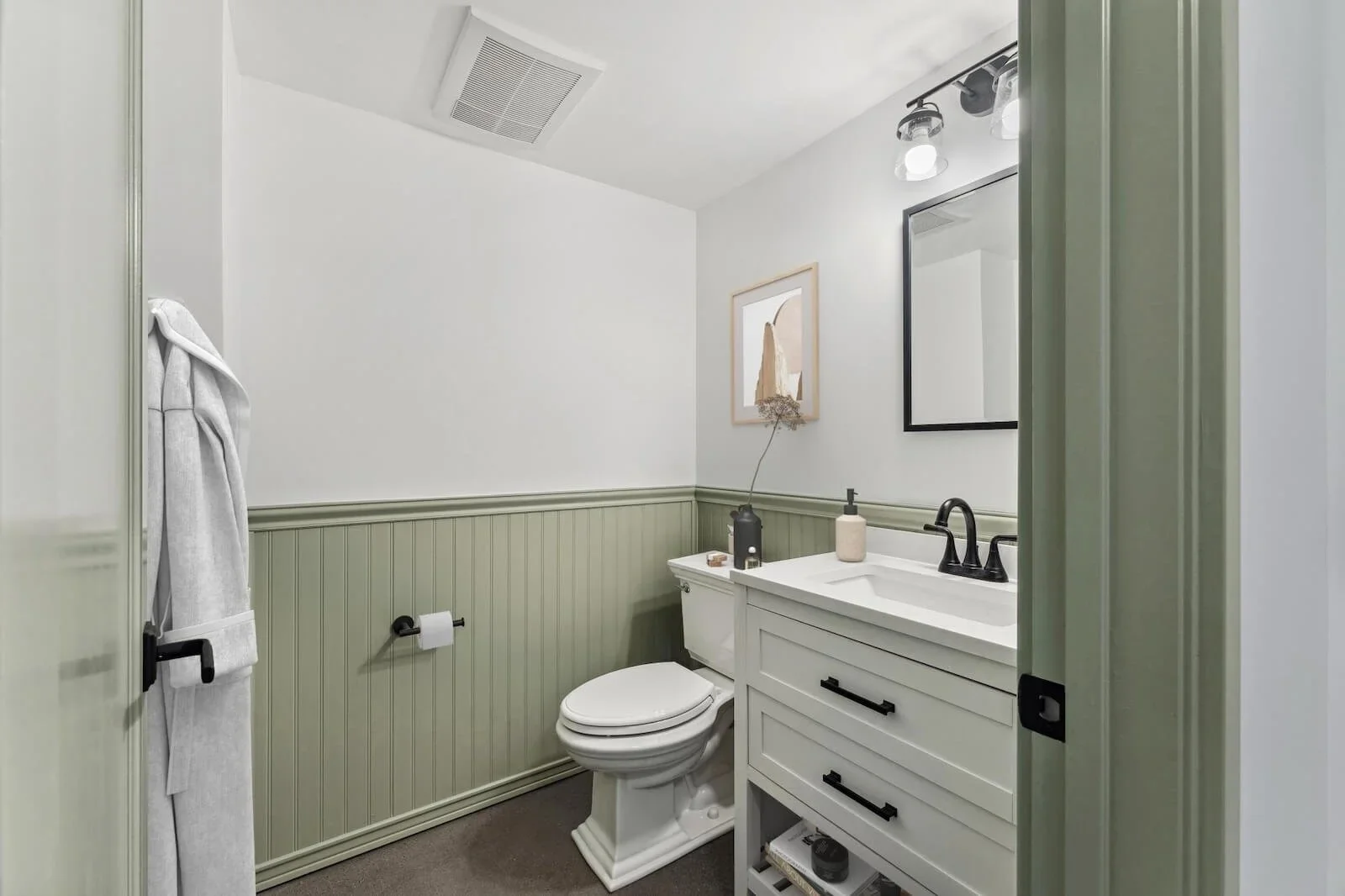
The guest bathroom addition upstairs allowed us to reduce the footprint of the guest bathroom on the first floor. We remodeled the full bath into a charming half bathroom. In the bathroom remodel, we simply replaced the window glass with double-paned tempered glass for energy efficiency but kept the original windows, blending old with new.
Downsizing the bathroom lended us space to expand the kitchen. While demo is typical in construction and can be chaotic but fun (as seen in many home makeover shows), we approached demolition a little more intentionally, by breaking down parts of the wall to widen the opening between the kitchen and dining room while still preserving some of the original architecture as an homage to its original design.
We added a touch of modernity by designing the kitchen remodel as an open concept, melding it with the backyard to allow full visibility from the front door, through the kitchen, and into the spacious greenery of the backyard. A beautiful La Cantina bifold door was installed, opening up the space between the kitchen and backyard, to create a true indoor outdoor living space.
The open concept sounds simple enough, but as with old homes, the entire kitchen and dining space was not level and sloped several inches. To preserve the beautiful original hardwood floors, we took each piece of hardwood paneling and picture rail trim out piece by piece and rebuilt the floor joist to level the ground. We restored the hardwood to its former glory and added mahogany wood in lace, refinishing it so that the new is indistinguishable from the old.
From an original Craftsman home styled in the 1900s to a modern Craftsman infused with historical charm, the newly remodeled home pays homage to its vintage roots while breathing new life into the space, and creating a home that our clients can grow into and create their own history in.
HDR Remodeling specializes in preserving the history of Bay Area homes, while seamlessly integrating modern designs to suit those who call it home today.
Take a deeper dive into this home remodel with more images of the kitchen, bathroom, and laundry room makeover.
Don’t let your home keep you in the past. Contact us today.


